
Main Menu
Hello, and welcome to the Visual Accessibility Skills Toolkit, or "VAST"!
VAST is a series of short articles aiming to spread awareness about visual impairments and their associated access requirements, followed by a series of guides that will help you to use accessibility tools in Adobe programs.
The goal of VAST is to help make the average self-published document more accessible than it currently is.
If you're already certified to work in accessibility-focused pre-press or PDF remediation, you'll probably be familiar with everything covered in these guides (and more), and may want to aim for a specific standard, such as W3C's WCAG 2.1.
VAST is divided into four sections:
Visual Impairment 101 explores what visual impairments are, how visually impaired people navigate digital content, and introduces some current language and definitions (circa 2023).
Screen reading PDFs explores the basics of how screen readers navigate through digital content.
Using InDesign introduces different tools that designers can use to make their documents more accessible.
Putting Into Practice presents case studies of common structures in roleplaying games, and how they could be given accessibility tags using tools covered in section 3. (Coming Soon!)
Accessibility is a Living Practice
This document was first published in November 2023. As of its writing, all of its information is presented to the best of our knowledge and research.
However, new tools are evolving every day. It is possible that Adobe could release new functions, or break old ones. (Note from Brian: Adobe literally changed the entire UI of Acrobat Pro after we'd finished writing our guides for it).We commit to reviewing these guides in November 2024 and November 2025 to ensure they are still accurate and useful.
Furthermore, we recognise that these guides aim to make it easier to access certain accessibility tools in InDesign, but also that the scope of this project meant that we couldn’t cover all of them.
If you’d like to help us out, please volunteer your expertise to expand this free knowledge base by emailing Brian at info@stoutstoat.co.uk.
How we involved the visually impaired community in the creation of VAST.
We'd like to acknowledge that Brian and Yubi, the creators of these guides, aren't visually impaired. Most readers of these guides won't be either.
Yubi has worked alongside the visually impaired community for years, and has co-written guides and documentation with blind members.
We affirm that it is important to stay up to date with the community. Visually impaired consultants were hired to give their thoughts on the concept of VAST as a whole, as well as the language and terminology we used throughout.
These consultants' input is a vital part of ongoing involvement with the community at large, and we are very grateful for their time and their expertise. These consultants were compensated for their time, or equivalent donations were made to a charity of their choice.
About the Writers
Brian Tyrrell is a writer, graphic designer, art director and games publisher. He runs the awards winning Stout Stoat Press out of his flat in Edinburgh. He identifies as neuroqueer, and is both autistic and gay.
Yubi Coates is a disability advocate, accessibility consultant and trainee textile conservationist. They have years of experience in accessibility consultancy within the TTRPG industry. They are currently a masters student at Glasgow University. They are both queer and disabled.
About Project Funding
Additional thanks to Creative Scotland's Create:Inclusion program, who provided a small pot of funding to pay for program licenses, training, consultations, and the resources needed to produce these guides.
A breakdown of how this funding has been used is available in Appendix A.3.

1. Visual Impairments
This first section will introduce you to the basic concepts you'll need to know about visual impairment, the visually impaired community, and how to access digital work.
1.1 What is Visual Impairment?
Visual Impairment is a broad term describing someone who has a loss or change in sight that isn’t solely corrected by glasses or contact lenses.
Someone who only needs glasses or contact lenses to correct their sight is not considered to have a Visual Impairment.
There are many different conditions that can cause Visual Impairments. Some are temporary while others are permanent.
Levels of Impairments
In the UK, Visual Impairments are split into two main categories: Partially Sighted, and Blind. These categories exist predominantly for legal reasons, such as to allocate support.
Different parts of the world use other definitions and additional terms. For example, in the US, four terms are used to describe visual impairment: Partially Sighted, Low Vision, Legally Blind, and Totally Blind.
For the purposes of these guides, we mean the UK categorisations when we say partially sighted or blind. More often than not, we’ll just use the broad term 'visually impaired'.
What sort of needs might someone have?
Categories and labels may be practical in legal contexts or theoretical discussions, but individuals will always have their own unique range of symptoms.
There are conditions that are adjacent to Visual Impairment, like Colour-blindness and Dyslexia. These adjacent conditions don’t prevent a reader from literally seeing your work, but they both still impact how a reader can engage with it.
The language surrounding disability is always evolving. Listen to disabled people when they talk about their experiences, how they self describe, and what accessibility aids really help them engage with your work.
Accessibility is for everyone
Below are some examples of different readers, the conditions they have that affect their ability to engage with a document, and some existing solutions that improve their access.
Iain is 26, a graphic designer, an avid TTRPG fan, and is red-green colourblind. When he plays games, he uses colour-swapping features to help see details he would otherwise miss, like the difference between friendly and hostile characters. When he’s running a game of D&D, he uses a high-contrast version of the rule books, which help him pick out the monster stat blocks and read-aloud text faster.
Fiona is 32, a blind games journalist, and loves playing high-fantasy and horror games on her Twitch channel. She uses a customised screen reader to navigate around her desktop, and her game manual PDFs have been exported with tags and alt-text so that she can read them herself. She includes the cues she hears in her games into the audio output of her Twitch streams, so her audience can better understand how she finds and takes down enemies in-game. She releases her own game guides via Patreon, alongside backups of her streams and reviews of other accessible video games.
Noah is 17, and a student at a local college. They’re dyslexic, and receive support from their form tutor to work on their reading skills outside of class. Joining their college’s roleplaying game club has really helped. They love to act, tell stories, roll dice, and slay monsters. Their friends borrow 1st edition gamebooks from the college’s library. Noah reads from a manual they printed out using a simplified companion document found through the publisher’s website. Noah's manual has all the same rules, but printed in a font they find easier to read, and at a larger point size. It helps them play at the table — and they can fill all the margins with the homebrew rules they write with their GM.
Simon is 41, and works long shifts at his local GP. He only has an hour between getting home and his players arriving for their weekly game night. He recently bought an adventure campaign off of itch.io, and the PDFs that came with it are tagged. He sticks in his earbuds, and turns on Adobe Acrobat's "Read Aloud" feature. It reads him the latest section he's supposed to be running, while he cleans his flat. He has the reading speed set moderately, so he's laying out snacks by the time its finished, ready for his players to arrive.
1.2 What are Tags?
Whether it's a website, a PDF, a Word document, or some other kind of media — everything you interact with digitally is written in code.
At its most basic, code contains content, and instructions for how that content should be displayed or manipulated.
Code comes in many different languages, such as HTML, CSS, XML, and so on. Each language has its own way of formatting instructions and content. This is like how we follow different grammatical rules to be clearly understood in different contexts, like when we hang out with friends or speak to colleagues at work.
Tags identify content
Tags are a common way that different coding languages format their instructions. They are used to identify and distinguish pieces of content.
For example, in HTML (a common format for most websites) there are <h> tags for the titles and headings on each page, <p> tags for paragraphs of text, and <a> tags for the clickable links that allow you move you from page to page.
Tags can contain Attributes
Tags can have Attributes, which provide more information.
For example, in HTML an <a> tag identifies a clickable link. The href attribute specifies the address of that link, such as href=https://www.vastguides.co.uk.
In graphic design, Tags and Attributes are used to format Content
Instructions can be written into code to set rules for how content with certain tags and attributes are styled.
Look at this screenshot of the Tabletop and Graphic Storytelling Fest website. On the left is the website as you’d see it in a browser, and on the right is its code.
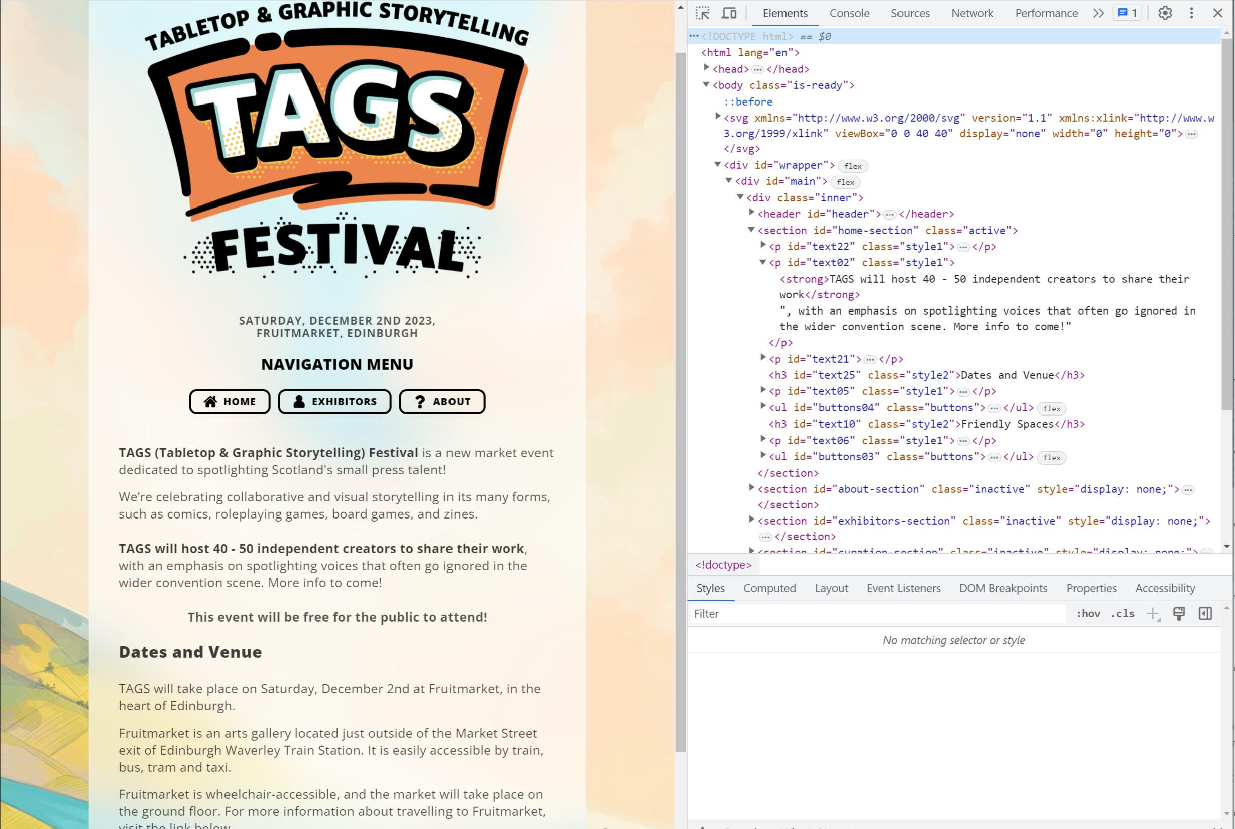
Look at this highlighted example:
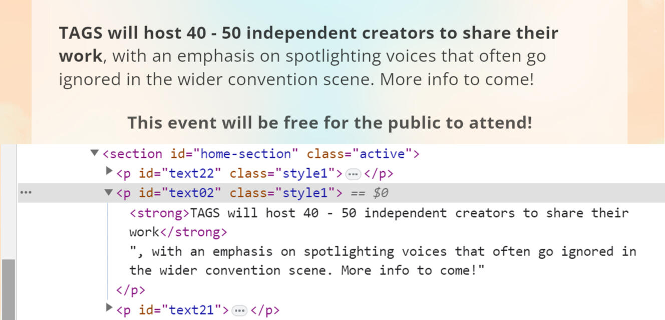
There’s a paragraph of text, the content we’re reading. Around that paragraph are different tags and attributes, and you can see how they affect how the paragraph is displayed:
The
<p>tag says the content is a paragraph.The
classattribute inside the<p>tag refers to a stylesheet, telling the web browser what this paragraph should look like. This includes which fonts to use, how big they should be, and where the text should be placed on the page.The
<strong>tags used around the first sentence of the paragraph change the preset styles’ font from light to semi-bold, visually emphasising its presence.
It is important to note that tags and attributes aren’t only used for formatting. However, for the purposes of these guides, that’s what we’ll be focusing on.
Tags are the foundation all programs rely on
In the previous example, the website’s code is intended to stylise the content on the page, establishing a visual hierarchy that makes sense to look at. Headers are bigger, paragraphs are smaller, and a reader can scroll through quickly to find the information they need. It does this through the consistent and systematic use of tags and attributes.
For visually impaired people, relying on a website's visuals to access content will obviously be more difficult, or usually impossible.
Instead, they can use Assistive Technology to read the same code and translate it into a new format, such as being read aloud, or presented through a refreshable braille display.
So long as the code being read consistently follows the grammatical rules established by its language, these programs will work fine.
Visual bias leads to misuse
Most code is written by sighted users, for sighted users.
Problems often come up when visually-focused code uses shortcuts that don’t affect what is displayed visually, but breaks the grammatical rules that code is intended to have.
This can cause assistive technology to present content out of order, usually in a way that is difficult or disorientating to navigate. It often cannot be navigated at all.
Designing accessible documents is, at its most basic, making sure that the code in your files is consistent with the standard expected grammar.
Accessibility Tags?
While all files use tags and attributes, not all of them follow certain accessibility standards that make them usable by assistive technology.
From this point onwards, when we say something has tags or is tagged, we mean that it has accessibility tags applied to its content, so that it can be navigated with a screen reader.
1.3 What are Screen Readers?
Screen readers, often abbreviated to SRs, are types of assistive technology. They aid in the navigation of digital content.
Screen Readers Reinterpret Code Into Text
There can be many forms of content inside a document; text, headings, images, clickable links, lists and tables, and so on. Much of this content relies on layout and context to inform to tell us how it should be read.
An SR will read the same tags used to format this content, and reformat it into a text-only format.
Screen Readers Convert Text To Speech
SRs can use a Text To Speech (TTS) engine built into its software or a computer’s sound card to read digital content out loud.
TTS engines use collections of sounds, called a voice bank, to form words. These voice banks can be swapped to change how content that is read aloud will sound.
Screen Readers Convert Text To Braille
SRs can also use an external piece of hardware, called a Refreshable Braille Display, to transcribe digital content into physical, touchable braille.
Virtual braille, or V-Braille, is in development for smartphones. It uses haptic feedback and vibration as a form of braille. Some of these features already exist, and can be used depending on the smartphone’s model and software.
Below is an embedded youtube video, demonstrating how Apple’s VoiceOver and Braille input features work together on an iPhone.Some viewers outside of the UK may have to watch natively on YouTube.
Screen Readers work in multiple Languages
SRs have a primary language, such as “English (UK)” or “French (Quebec)”. The primary language determines how the SR uses its voice bank to form the words it reads aloud, allowing it to portray tone, inflections, and accents, as well as present special characters in Braille.
An SR can switch between multiple languages as it reads, so long as the content it is reading is tagged with these different languages. If languages aren’t tagged, then an SR will read any foreign words as if they’re written in a document's primary language.
Controlling a Screen Reader
SRs can be controlled with keyboard inputs, audio commands, or touch gestures. Users may also have access to system commands, and device-specific features, like Haptic Touch, to make the use of their SR more immersive.
Reading at the speed of sound
SRs are essential tools for blind users, and for people with a wide range of visual needs. Regular users often have the speed of their TTS set far higher than someone using an SR for the first time can comfortably follow.
Below is an embedded video demonstrating how Jamie Teh, the co-creator of the Windows screen reader NVDA, can listen to content at a speed of 900 words per minute. For context, most human conversations have a speed of 100 to 150 words per minute.Some viewers outside of the UK may have to watch natively on YouTube.
Availability of Screen Readers
Nowadays, most screen-based technology has some kind of inbuilt SR, such as VoiceOver for Apple products, Narrator for Windows, and Talkback for Android devices.
Other SRs can be downloaded and customised depending on the needs of the user, such as NVDA (which is free) and JAWS (which requires a paid licence).
Did you know?
One of the first SRs was developed in the 1980s by the Research Centre for the Education of the Visually Handicapped at the University of Birmingham.
1.4 What is Reflow?
Reflow is a common function available in most standard content readers, like PDF readers and web browsers. It allows content in a document or on a webpage to be moved and resized without altering the original code. Web browsers often use reflow to switch between ‘mobile’ and ‘desktop’ versions of websites.
In reflow mode, the layout of text changes to meet the user’s needs, flowing around other objects, like images. If you can, try resizing this browser page to see how it changes!
Below is an example of Twitter using reflow:
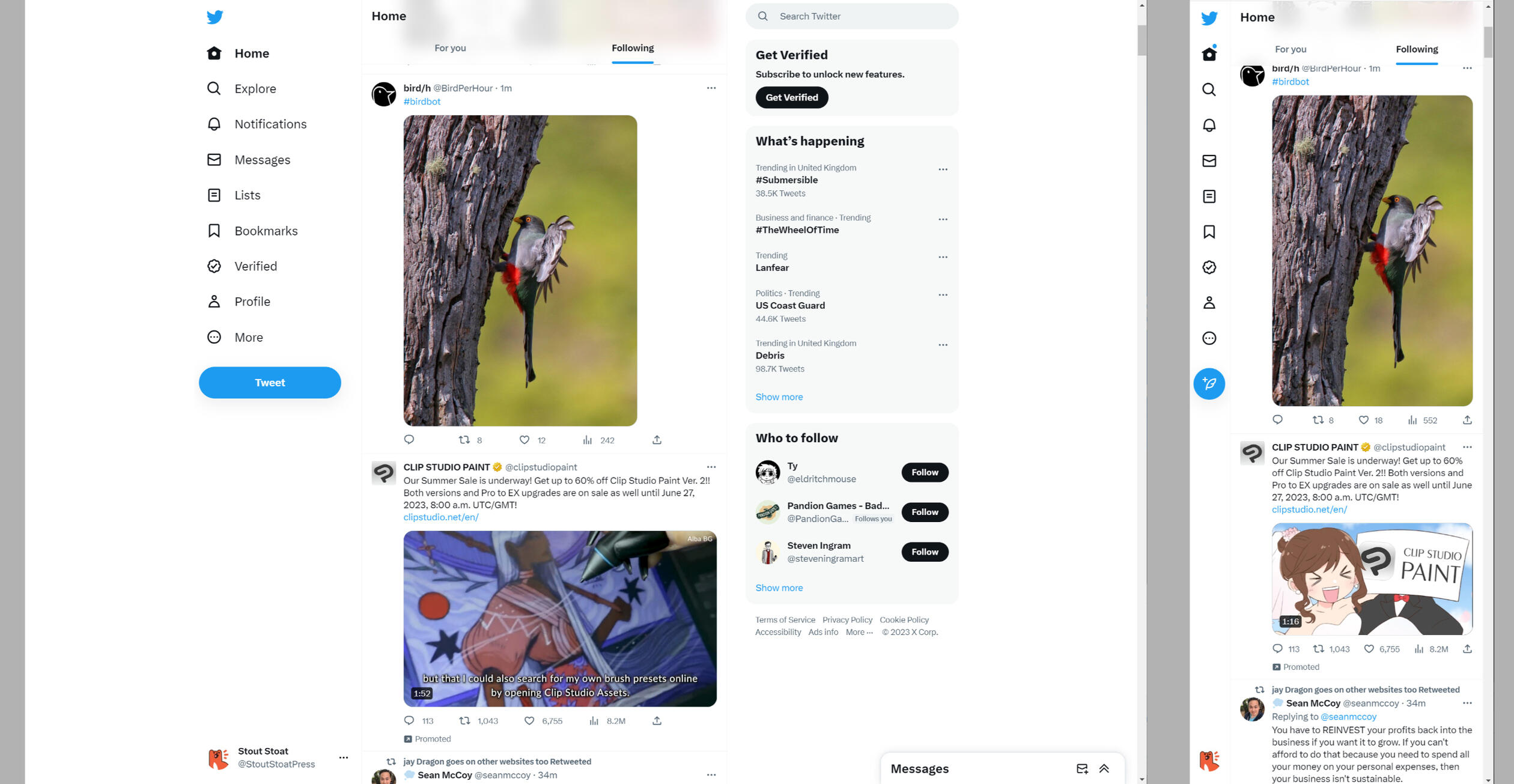
Why is reflow important?
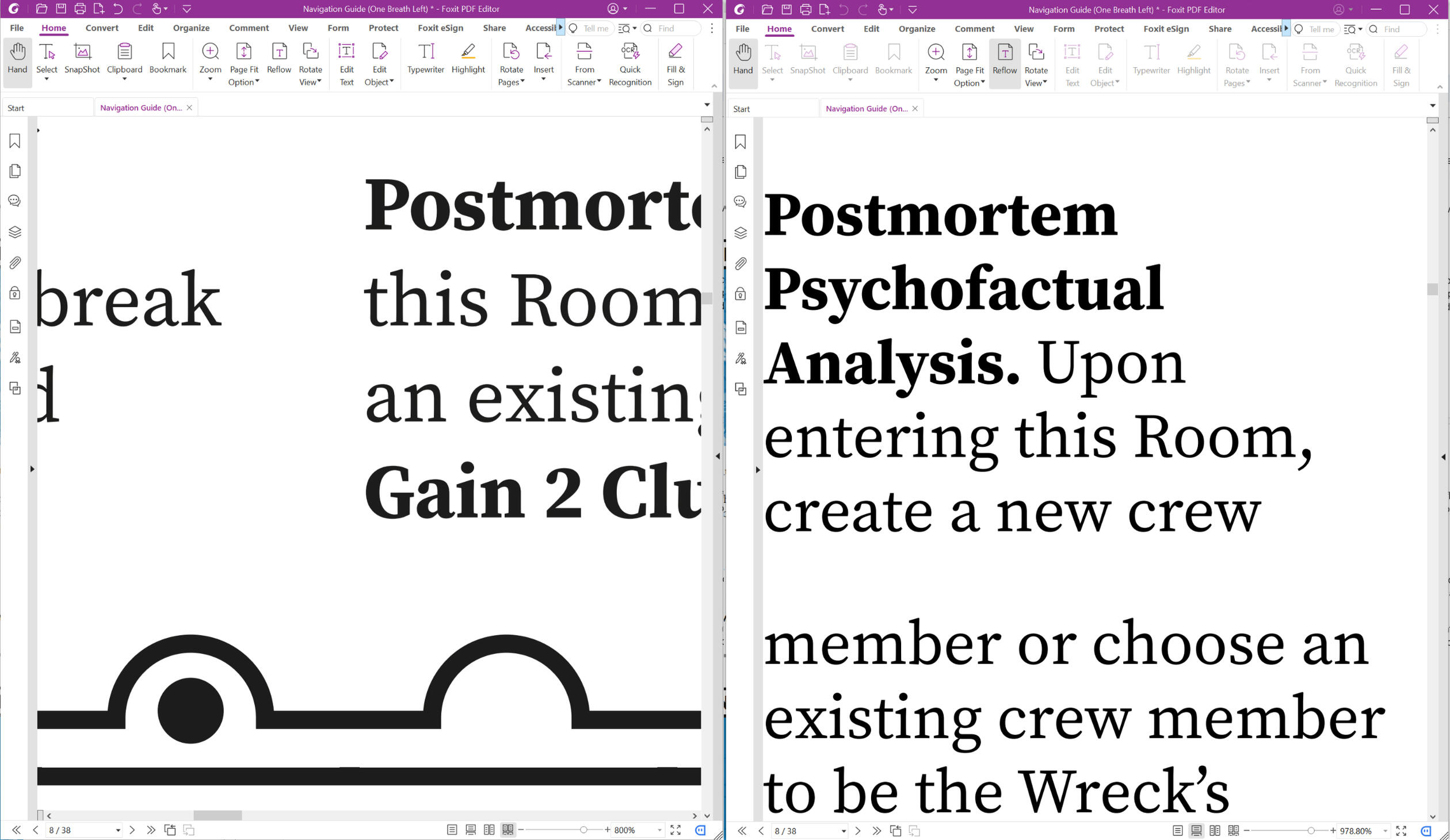
Reflow allows a user to change the size and shape of content for more comfortable reading. This function is of great use to partially sighted users, who might not be able to read a page of text at arms length, but can read individual sentences or words if enlarged.
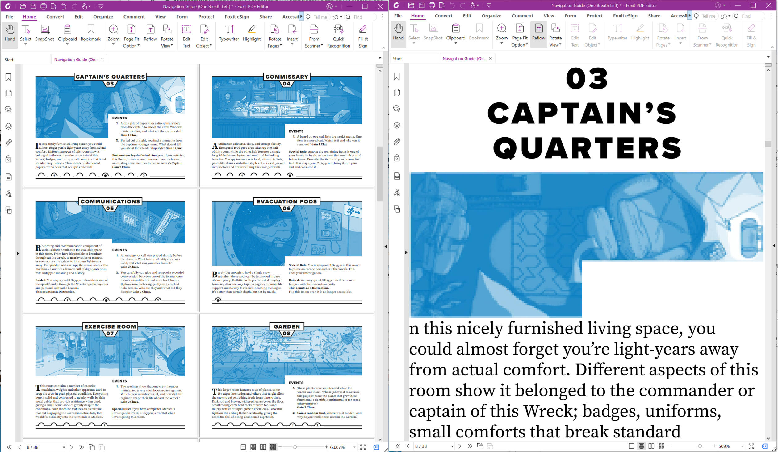
Below is an example of an unchanged PDF on the left, and a reflowed PDF on the right.
Some reflow functions also allow a user to change aspects of content, such as changing a text's typeface and changing the colour or background of text. These changes can help a user read heavily stylised text, such as long passages in cursive handwritten fonts, or italicised descriptions.
Reflow versus Zoom
Reflow alters the structure of a page, so that content only needs to be navigated in one direction (scrolling up & down).
Zooming in maintains the structure of a page, and requires the user to scroll in two dimensions (left & right, as well as up & down).
Coordinating yourself in two dimensions can quickly become disorientating at higher levels of magnification, especially for documents with changing layout structures, like multiple columns of text.
Below are two examples of the same PDF. On the left it has been zoomed in, and on the right it has been reflowed.
Why do I need to think about reflow?
While most documents can be reflowed without the author having thought about reflow as a function, PDFs are generally exported as a fixed unchanging layout. All the elements on that page exist exactly where they were placed, with no ability to shift when zoomed or scrolled.
This in and of itself is good; some readers need the ability to zoom in on particular text to read it while otherwise still maintaining the structure of the page. However, it is possible to tag a PDF when exporting it which allows the content to reflow.
For comparison, EPUB files act like a basic HTML website. They are naturally are a reflowable format, but simply converting a complex PDF to an EPUB file doesn’t mean it will reflow nicely.
What can go wrong with reflow?
At its most basic, elements can display out of place. Text and images can get jumbled up if images are not anchored to specific text. Tables with empty cells can get misaligned and become difficult to understand, especially if they’re complex in nature.
Reflow done correctly can still seem jarring to those not used to it, and some elements of confusion cannot be alleviated due to software limitations (like empty data cells in tables), but workarounds can be found (like filling in empty cells with a dash character; e.g. ‘-‘).
These workarounds are compromises (for example, the previous dash character '-' doesn't read aloud by default for most screen readers, unless they are calibrated to do so.)
1.5 Language and Definitions
Many of us will have internal biases, make assumptions, hold incorrect knowledge, and use outdated terms in our day to day lives. Acknowledging this allows us to examine and address these issues, and hopefully to do something about them.
Language and terminology are living, changing concepts which reflect the people and societies using them. It is important to listen to the communities that are being discussed to understand what language and terminology they use, and to be aware of differences used by those not within those communities.
The accessibility of "Accessibility"
A reality that must be faced is that most work published in the small press sector is produced either by individual creators, or small teams of 2-5 people. Many creators are working in their spare time alongside a full time job, or while stretched across the responsibilities of many different jobs at the same time.There are many different accessibility standards that exist in the world. Many of them have precise technical requirements that, when adhered to by a specialist, will create vastly superior documents. These standards are vitally important; they set the baseline expectations that disabled people can navigate the world by.Only the largest publishers in our industry have the means and capacity to consistently hire specialists to help make their products more accessible (which they should be doing, but often aren't).
Can a document ever be "Accessible"?
There is a common misunderstanding that a single document can be made to be "accessible" to everyone. This is impossible; there will always be a shortfall. For example, measures taken to accommodate for one reader's colour blindness might aggravate another reader's migraines.When discussing accessibility, we believe it is better to help each other implement individual measures (such as adding a ramp to a staircase, or tags to a PDF), rather than tear each other down for failing to meet every point on a constantly evolving criteria.
Definitions
The goal of VAST is not to aim for a specific standard, but instead to help make the average self-published document more accessible than it currently is.
With that in mind, we advise that you use the following terms when talking about your own work in relation to visual accessibility.
Describing Access
Access. What can be accessed; the ability to get to and interact with a resource.
Accessibility. How easily the resource can be accessed or used.
Visual impairment. A loss of sight which cannot be corrected by glasses or contact lenses.
Visual accessibility. Different measures taken to make visual media more accessible. E.g. adaptations for colour blindness, or tags for screen readers.
Screen Reader (SR). Software and/or technology which converts text into another format (e.g. speech, Braille, etc) and can navigate technology through user inputs. Each screen reader will work in slightly different ways and which one is used is down to what’s available on the hardware and user preference.
Describing people
Sighted. Anyone who isn't visually impaired. E.g. A sighted reader, they're sighted.
Visually Impaired. Anyone who is partially sighted or blind. E.g. A visually impaired reader, they're visually impaired.
How someone choses to describe themselves will differ from person to person. There are two common approaches, and they differ on what is prioritised when addressing someone:
Identity-first. E.g. a visually impaired reader, an autistic artist.
Person-first. E.g. a reader who is visually impaired, an artist with autism.
The consultants we have worked with prefer to use Identity-first language. We tend to use a mixture of identity-first (e.g. visually impaired readers will...) and neutral language (e.g. screen reader users will...) throughout these guides.You can read a more in depth history of these two approaches on the National Institutes of Health website.
Describing a document
These terms were developed through consultation with the blind community. We've tried to use terminology that the TTRPG industry is familiar with, and that existing technology also currently uses.
Printer-Friendly. A black and white document, designed to be printed using personal inkjet printers, using a conservative amount of ink or toner, and be read as a physical paper document.
Untagged. A document with no accessibility tags. It cannot be interacted with by assistive technology without some form of user intervention, such as auto-tagging.
Tagged. A document with accessibility tagging. It can be interacted with by assistive technology at the point of being opened.
Companion. A supporting document that presents information from a main document in a different format. A reader might use a companion document as their primary way of accessing media, or might keep a companion document open alongside a main document, referencing it as needed for additional clarity. Different kinds of companion document include:
4a. Colour Blind. Colours have been modified to account for one or more different forms of colour-blindness.
4b. Plain Text. A file with no formatting except line breaks between paragraphs of text; no character styles, changing fonts, illustrations, highlighting, colours, tables, charts, and so on.
4c. Rich Text. A file containing basic formatting, such as paragraph styles, character styles and straightforward fonts. Alt-text has been transcribed in the place of illustrations, tables, charts, and so on.
Here are some examples of this language in use.
“When you unzip the folder from itch, you’ll see two print and play folders. One is a full colour version, and another is printer-friendly”.
“Here’s the first ashcan of my zine! It’s just screenshots from my notebook at the moment so it's untagged, but I’m working on typing it up over the weekend!”
“Here’s our new one page game. You can download a tagged PDF or a tagged DOCX over on my Patreon.”
“Update 0.6. We’re out of closed beta, and are now working on graphic design. Here’s the latest PDF, with a rich text word doc.”
Clarifying existing terms in our industry
The following terms already have defined meanings from the visually impaired community.
We have seen them used incorrectly online, especially in TTRPG publishing spaces, and are clarifying their meaning here.
Text Only (e.g. a .TXT file). A text file type which contains no formatting because the file cannot store formatting information. It is text, made up of characters, spaces, and line breaks.
Raw Text. A colloquial term for a text file which intentionally contains no formatting, including in-text formatting such as mark up. The file type may still be able to store formatting information.
Unformatted. (E.g. Unformatted .DOCX). A file which intentionally contains no formatting. The file type may still be able to store formatting information.
What are the origins of these definitions?
Many of the concepts behind the terms were workshopped in preparation for a course Yubi co-wrote with Raina, a blind colleague. This course was one of the first attempts at introducing accessibility measures to individuals wishing to publish in the TTRPG field.
The language established in that course has continued to evolve, and with the input of the hired consultants for VAST, we have created a series of definitions which aim to form a basic lexicon for accessibility when publishing documents.
We understand that the language we use is not fixed, and it may become necessary to update terms and definitions in the future.We are always happy to hear further thoughts and opinions from the visually impaired community on the language we use.
2. Screen Reading PDFs
Before we can start to implement accessibility features in our own documents, we need to know what our efforts will look (and sound) like.
Below is an embedded youtube video that visually demonstrates how two different screen readers work; NVDA and VoiceOver. It covers basic navigation through text, headers, lists, graphics, tables and links.
A transcript of this video is available in the Appendix.
Tags in PDFs
2.1 Text in PDFs
Text in a document can be divided into two categories; Headings, and Paragraphs.
Headings (sometimes called Heads in graphic design) are used to help readers navigate around a piece of content. They are placed adjacent to paragraphs, signposting what content those paragraphs contain.
In graphic design, Headings can be described with letters; A-head, B-head, C-head, and so on. More commonly in word processors, design software, and in code tags, those same Headings are described with numbers; <h1> , <h2> , all the way through to <h6>.
Heading levels are sequential; A has a higher priority than B, 1 has a higher priority than 2, etc. The lower the heading level, the more specific the information it is signposting.
As a general rule, any text that isn’t a heading is usually a paragraph, tagged with <p>. Visual differences may distinguish it on a page, but to assistive technology it all looks the same.
What tags are there for Text?
The tags used for text are very simple. <h1> through <h6> are used for headings, and <p> is used for regular body text.
In PDFs, the <artefact> tag is used to indicate anything that assistive technology is meant to ignore. This is usually applied to Objects, but can also be applied to text (such as page numbers or running headers).
Below is a Header tag. Inside of the tag is its content, "AIRLOCK".
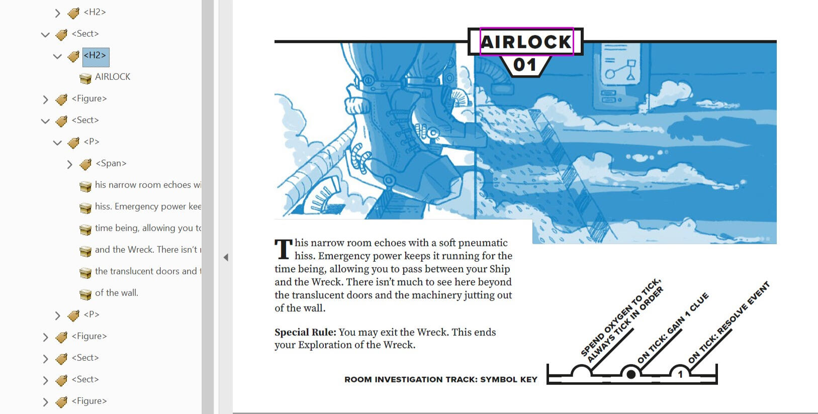
Below is a Paragraph tag. Inside of it is all of its content, which is organised across multiple lines of text.
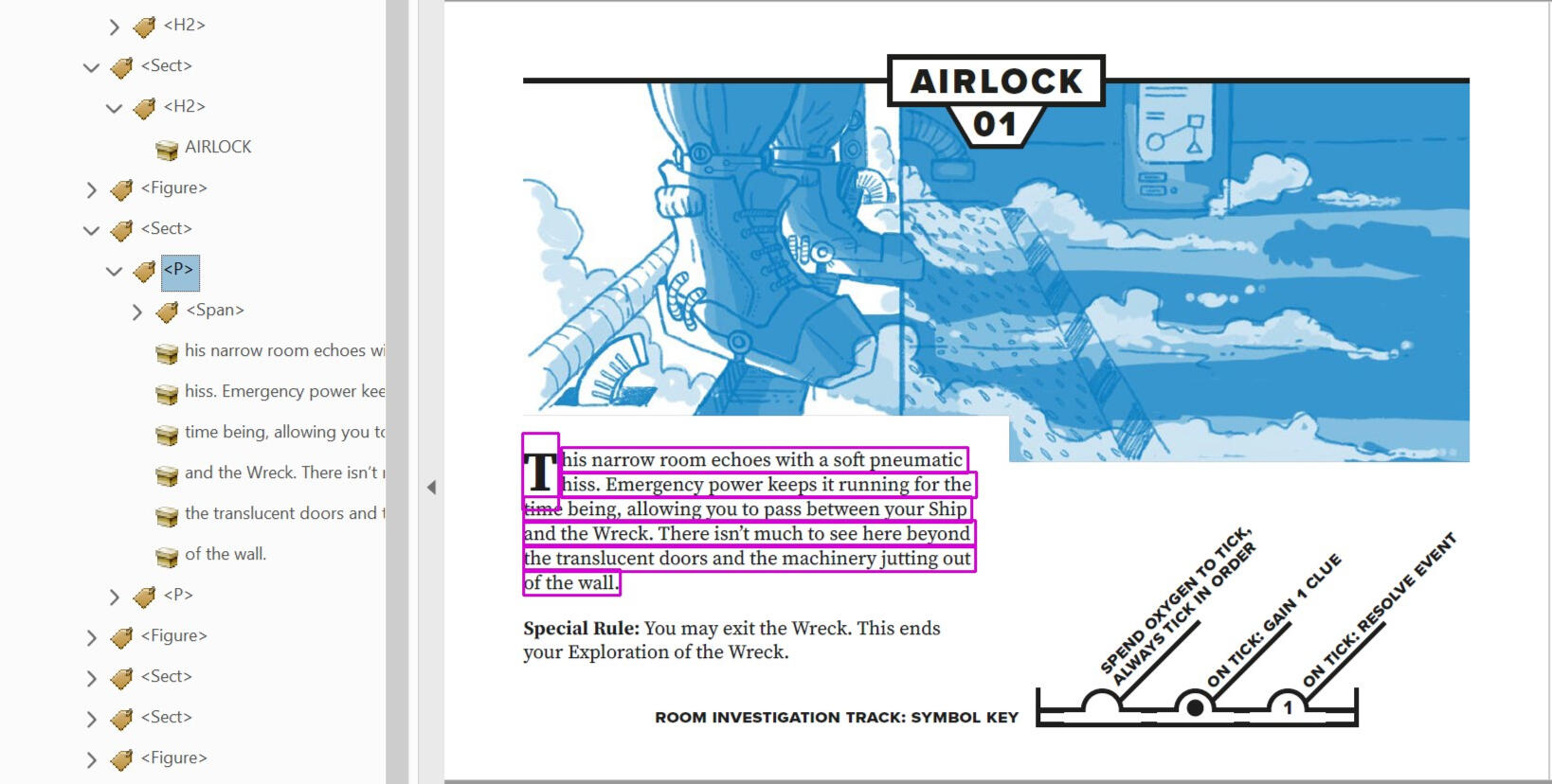
You might notice the <Span> tag in with the paragraphs content. <Span> tags are used to mark up sections of text (or any other kind of content) for specific formatting.
In this example, the <Span> tag contains the "T" drop cap from the start of the paragraph. It still reads as part of this paragraph, because it's inside of the <p> tag.
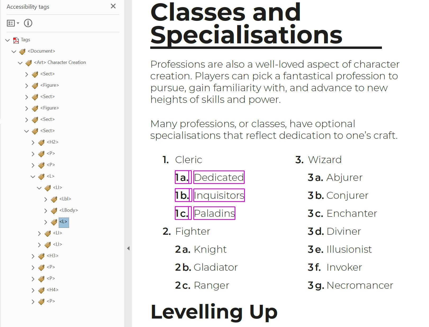
2.2 Lists in PDFs
A list is, quite simply, a sequential group of items. Here is an example list:
Apples.
Bananas.
Cherries.
What tags are there for Text?
Lists inside of PDFs use four different tags:
List
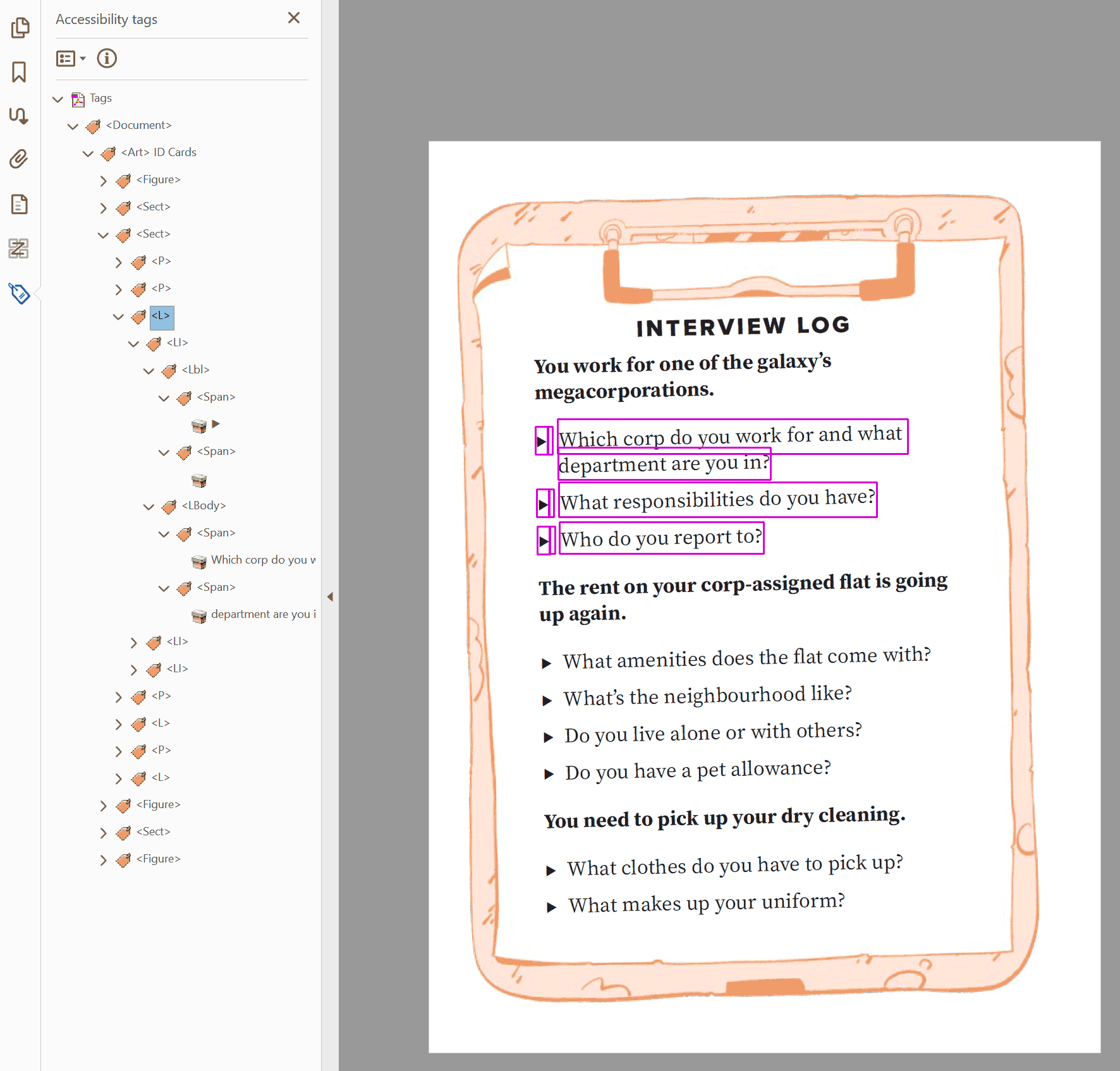
<L>describes the start of a list.List Item
<LI>describes an individual item inside of a list.Labels
<Lbl>describes the preceding identifying information before the content of a list item. This is the bullet point, the number, the roman numeral, etc.List Body
<LBody>contains the body of the item on the list. This is usually text tags like<p>.
Note: <LBody> tags can also hold other forms of content, such as <figure> tags. However, these implementations are unreliable and inconsistent, so it is recommended that you only include text inside of lists.
In PDFs, the separation of <Lbl> tags and <LBody> tags is helpful, allowing you to troubleshoot problems in isolation.
For example, you’ve used a unicode symbol as a bullet point (e.g. a right triangle symbol, such as ᐅ), but it’s interacting poorly with the assistive technology.You can mark it as an artefact to be ignored, or change the readout to a standard bullet point character (such as •) without breaking the visual aesthetic or sacrificing the functionality of your list.
2.3 Objects and Alt Text in PDFs
Objects are visual elements inside of a document. They are relevant to the text, directly communicating information to the reader, or otherwise enhancing the text they are next to.
Most visual elements in a document are objects, like images, textures and page decorations. Objects can also be rasterized or vectorised text, interactive elements like buttons, clickable links or embedded videos, and many other things.
If in doubt, anything that isn’t text is most likely an object.
Alt text is an accurate description of an object
Objects and interactive elements in a digital document can be tagged with an attribute called alt, which stands for ‘alternate text’ and is often shortened to alt text.
Originally pioneered in the early days of the internet, alt text would be displayed when an object on a website couldn’t be loaded or viewed properly. It was also attached to web links to describe their destination.
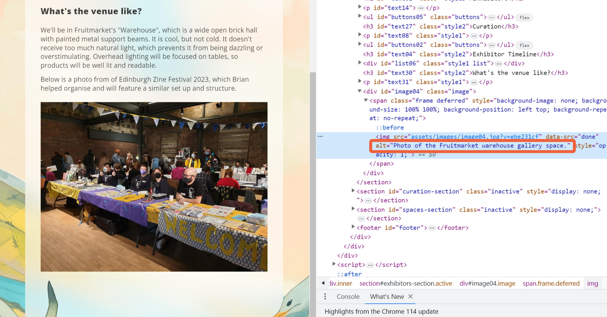
Most browsers and programs won’t display alt text unless you look for it. On a web browser, you can usually right click any object element on a page, select Inspect Element, and open a website’s code to see its alt text. In a PDF, usually hovering your mouse over an object will reveal its alt text.
Nowadays, almost all assistive technology relies on alt text to communicate to their users what an object is.
Alt text isn’t a caption or a title
There are two similar attributes that are often mistaken for alt text. They are called Captions and Titles.
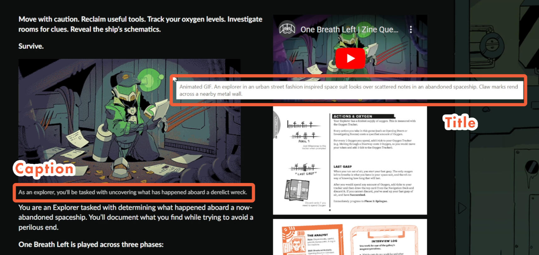
Captions are sections of text that are rendered adjacent to an object, usually below it. They are used to give additional context to an object, such as photo credits in a magazine. While a good caption can be a compromise when alt text can’t be applied, it isn’t actually alt text.
Titles visibly render when you hover your mouse cursor over an object, or long press it on a mobile browser. Like captions, they can give additional context, but aren’t what assistive technology first looks for.
Where is alt text used?
Alt text is a widely available function. You can add alt text to your social media posts, when you import images into your word processor, and attach it to almost any visible object in graphic design software. Every platform has its own way of doing it, so it is best to look up a specific tutorial. We explore how to add alt text in InDesign in Section 3.
Some websites or programs may call alt text by a different name. Itch.io, an entry-level friendly marketplace for many creators, only has one entry field, “Title”, which assigns an image with the same text for both the title attribute and the alt attribute.
Disappointingly, there are still many sites that don’t facilitate alt text consistently, despite it being a basic and well-established feature. Looking again at itch, while they facilitate alt text for images inside of a project’s story, they don’t allow alt text for a project’s banner image, or its preview screenshots.
What tags are there for Objects?
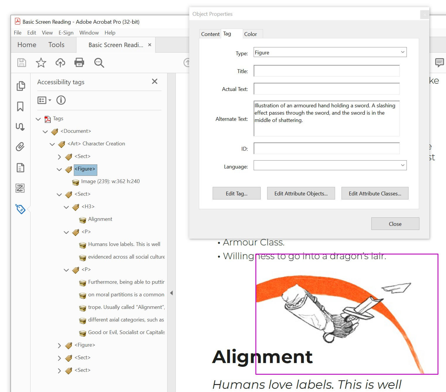
In PDFs, objects use the <Figure> tag, no matter what kind of content they are. Alt Text is an attribute of this tag, so it isn't visible in the tag tree. Instead, you can see it by opening the Object Properties panel and inspecting the tag.
How to do this is covered in detail in 3.9 Checking your work.
2.4 Tables in PDFs
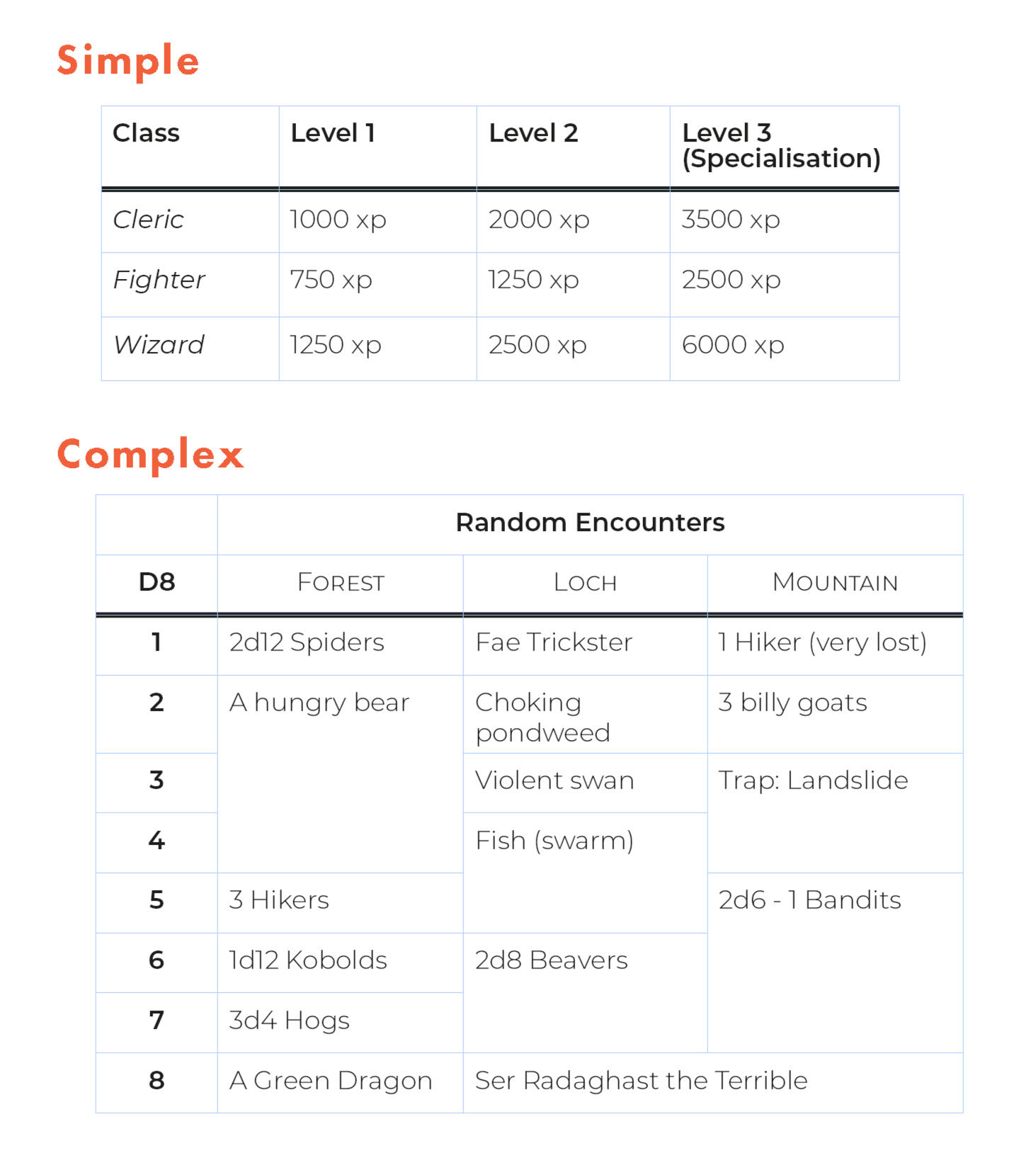
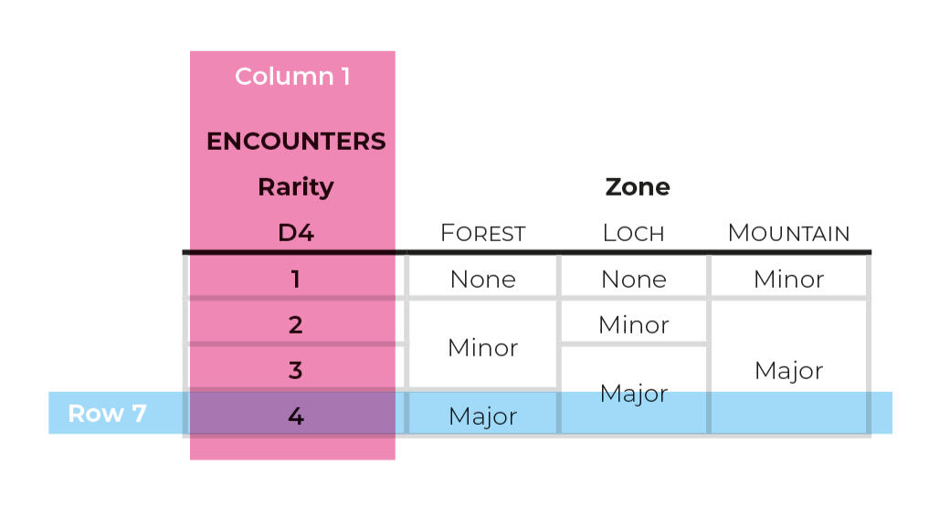
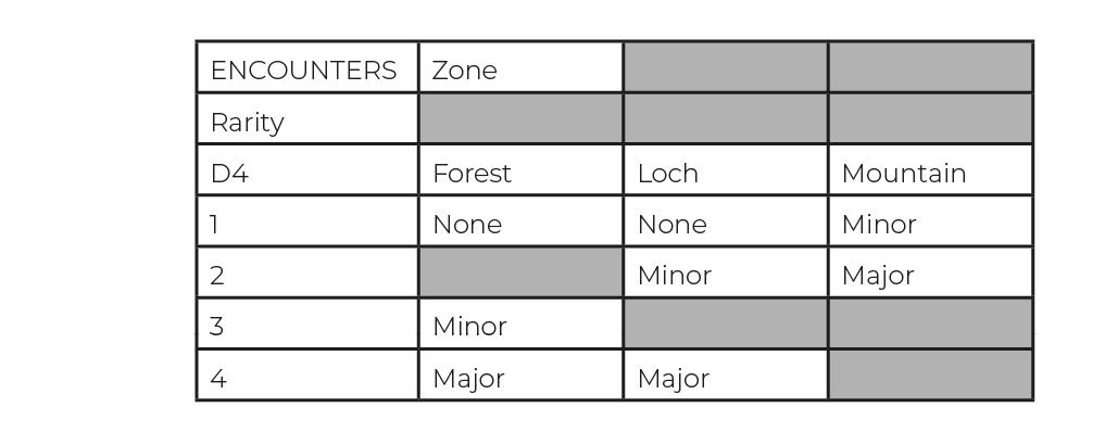
Simple tables have individual cells filled with content in each of their rows and columns. They have header cells along their top row, and optionally header cells down their first column.
Complex tables use features like cell merge, creating unequal divisions of cells. They leave some cells empty of content. They have overlapping heading structures, where header cells are required across multiple columns or rows to give a cell its proper context.
A quick word of reassurance.
Table tags are some of the gnarliest in this guide. If you get confused, it's okay to move on and return later once you've grown familiar with other tools first.
What tags are there for Tables?
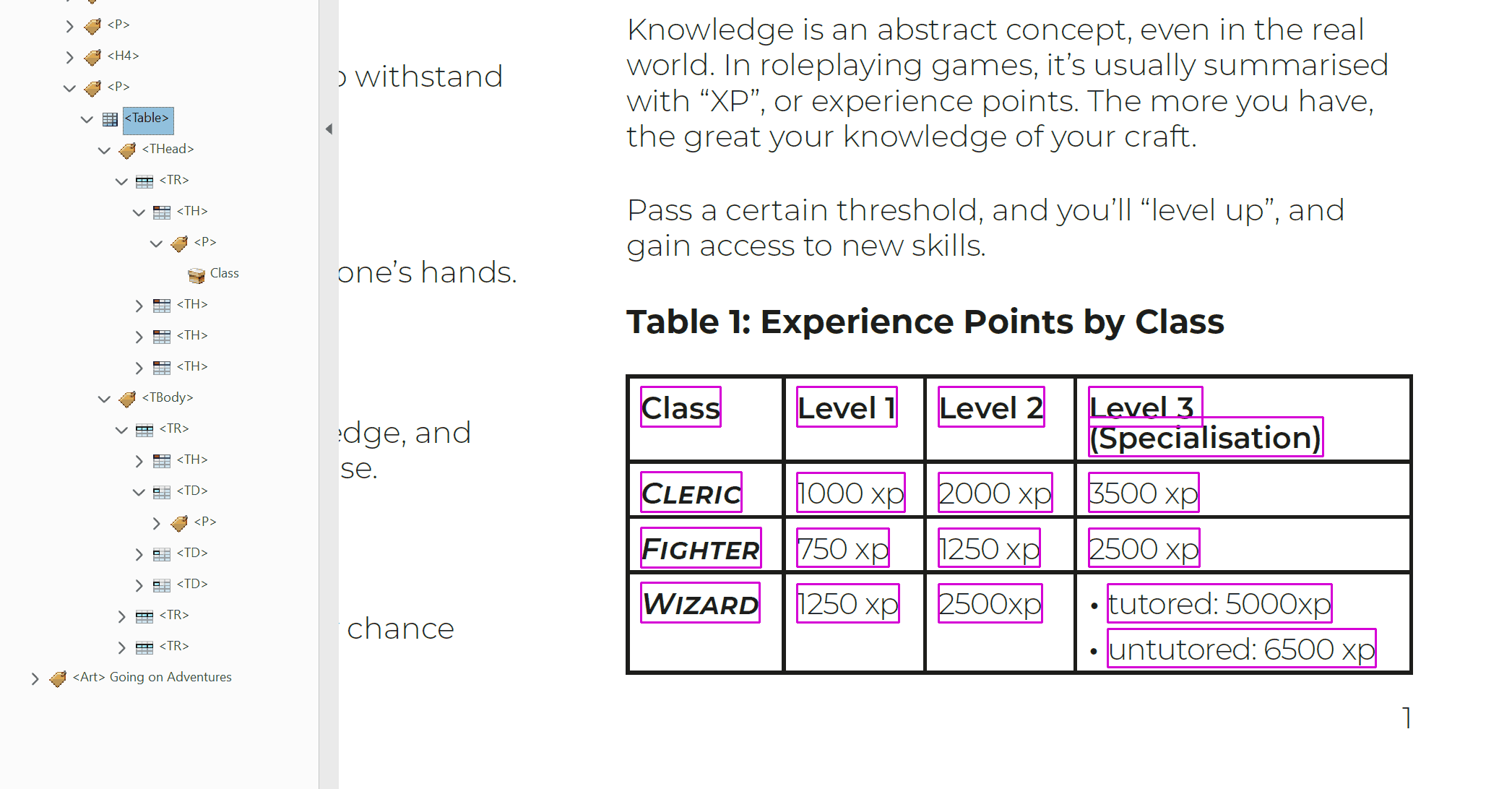
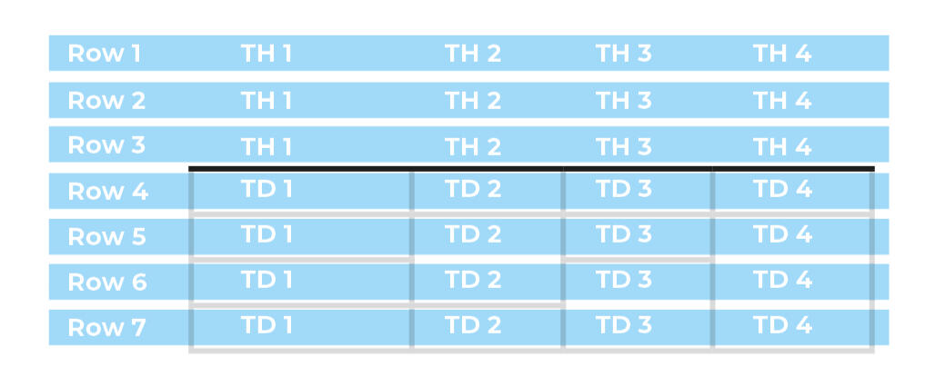
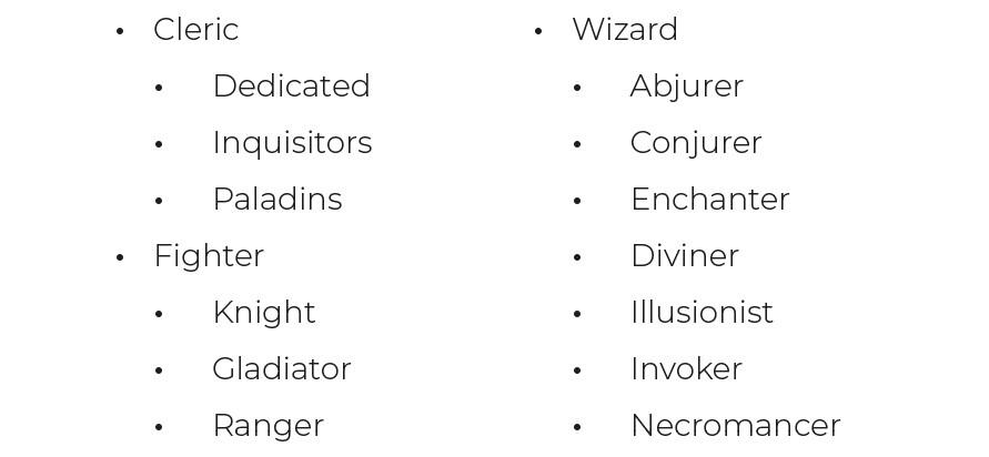
<Table>contains the head and body of a table. It is also the signpost of a single distinct table that assistive technology can navigate to.<THead>contains the rows in a tables header. All cells inside of a table's head should be treated as<TH>cells.<TBody>contains all of the other rows in a table.<TR>contains all the cells of a single row. The order of these tags is the same as the order of the rows in the table. These can be nested inside of either<THead>or<TBody>tags.<TD>contains the data of a single cell. It's order within a Table Row tag determines how far along the row it is. These cells can contain<P>tags. They can also contain other tags, such as<L>and<Figure>, but these will need additional scrutiny to make sure they're working properly.<TH>cells can contain the same content as<TD>cells. These header cells are read out to give greater context to body cells as you move around a table. E.g.<TH>Class, and<TD>Cleric, Fighter, Wizard.
What attributes can cells have?
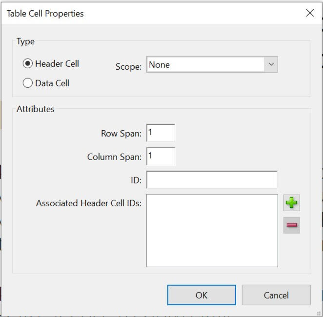
Scopedetermines if a<TH>cell should apply to a column, row, or both. A header cell's position in the tag tree determines which cells it is a header of. A value ofNoneleaves an SR to interpret how it should be applied.IDis used to create a unique identifier for<TH>cells.Associated Header Cell IDsis used by<TD>cells to read out specific header cells, instead of what might apply to the cell by default. This is important when clarity is needed, such as when merged cells are being used or there are multiple header cells in a single row or column.
Cell Span and Merged Cells
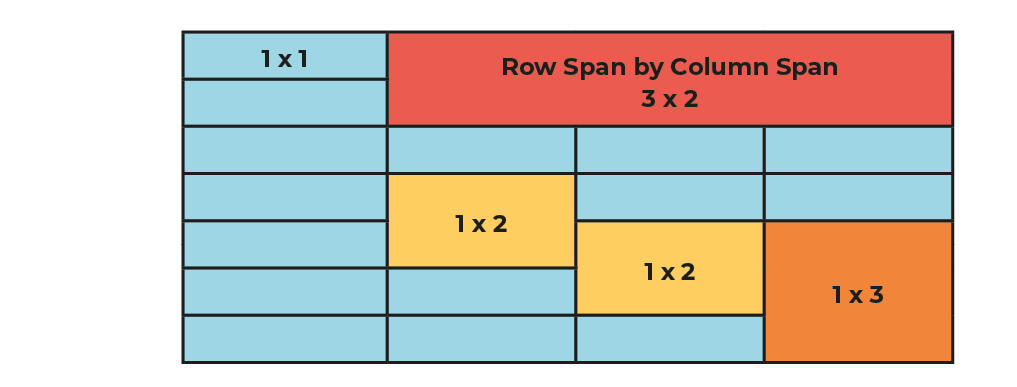
The problem with Complex Tables
A transcript of this video is available in the Appendix.
3. Using InDesign
This section contains guides that will show you how to use various accessibility tools available in Adobe InDesign CC 2023.
These guides prioritize information to help you create tagged PDFs. PDFs are one of the most popular formats in the self-published TTRPG market. They offer rich media display, as well as many different accessibility options.
Guides Menu
Proactive versus Reactive
The guides in this section will help you be Proactive in your visual accessibility work. By following them, the majority of what you export from InDesign should be accessible to screen readers and other forms of assistive technology.
We always recommend that you do as much work on accessibility in the source document as possible. This saves a lot of time in the future, when you inevitably need to re-export documents with new errata, updated wording, fixed graphics, or other slight changes.
Using programs like Acrobat Pro to fix the tags in a document is a Reactive form of accessibility. There's nothing wrong with it (in fact, for more advanced features like complex tables, it is necessary). However, by fixing the end export and not the source document, you will have repeat this work with every new update. And with every iteration, there's a chance you'll make mistakes.
Why make PDFs?
There are many different file formats for a publisher to choose from, and a lot of them are much better in terms of accessible.
However, few are as visually rich and widely available across reading apps and operating systems as the PDF. It's a staple of our industry, and an expected norm.
Furthermore, design work is time consuming, especially for self-publishers and small presses. Many designers don't have the resources to produce and translate their projects across different file types, nor have the time to learn how.In the future, we'd like to collate guides for producing EPUBs. However, for now, PDFs are our focus.
Why make guides for InDesign?
As the creators of the PDF, it is no surprise that Adobe has a monopoly on tools for implementing their accessibility options.It is unfortunate that, at the time of writing, there are no easily affordable and low skill requirement design programs that also provide tagging features. Even worldwide staples like Google Docs are unable to export tagged PDFs. (I recommend you read Jacob Wood's report for more details.)Some options exist that can fix documents retroactively after export but, as discussed above, these options are repetitive and time consuming and ultimately against our focus of making "accessibility" available to smaller designers.Affinity Publisher is currently very popular among TTRPG designers. We really hope they’ll include the ability to customise and export tags for PDFs in the future, and ask that you request these features of them. If Affinity include tagging features, we'll aim to collate new guides for their use.
Update 30/11/2023: Affinity and Alt Text.In their latest update, Affinity announced new tools for Publisher that support Alt Text for images and objects. This is currently the only accessibility tool they offer, but we'll keep an eye on new tools as they debut.Please note: Some of Affinity's guidance is outdated. Alt Text can be longer than 140 characters. You can learn more about this in Section 3.4.
3.1 Tagging Paragraph Styles
In most word processors, design softwares and websites, styles are created to make text look uniform. InDesign’s version of this is called Paragraph Styles.
Instead of having to specify the characteristics of a font for each section of text, you can create a paragraph style and apply it to that text.
As part of this template, you can also add a tag to the text, like <h1> or <p>.
Instructions: Assigning Tags to Paragraph Styles
Open the Paragraph Styles window (Window/Styles/Paragraph Styles).
Double click on an existing Paragraph Style to open its Options panel. Note: doing two slow clicks will edit the style's name instead of opening the panel.
Inside the Options panel, click the Export Tagging tab.
Look at the "EPUB and HTML", and "PDF" groups. Both have a field, labelled Tag. By default, they will be set to [automatic]. Change this to the appropriate tag for your text.
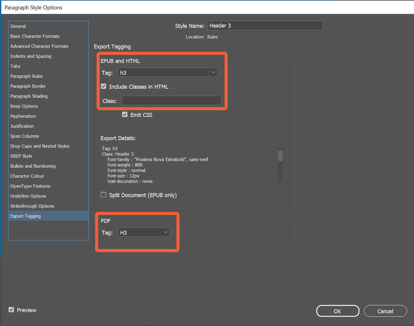
When set to [automatic], InDesign will assign tags that it feels are appropriate to any text you export. This feature is useful for other kinds of content (like lists) but when making headings and paragraph styles we want to use tags intentionally, rather than by accident.
Styling 101
In InDesign, text is visually formatted with Paragraph Styles and Character Styles.Paragraph Styles are applied to a section of text separated by a paragraph break. Paragraph Breaks are usually typed with the Enter key on a QWERTY keyboard.Line Breaks, which are typed with Shift+Enter, will visually move your text to a new line but still classify your text as a single section of text. Some screen readers will interpret a Line Break as a new paragraph, and wait for its user to manually advance.Character Styles are applied to individual glyphs (i.e. letters, numbers, special characters) in a section of text. Character Styles will override a section's Paragraph Style.You should use Paragraph Styles to set standardise large sections of text (such as your headers, body text, block quotes, and lists), and use Character Styles for conditionally modified text (such as using a bold font for a new game term, or superscripting a footnote number).
Tip: Clear Style Naming
Put the assigned tag at the start of your paragraph style’s name, so that you remember what tag it's using. For example:
P Article Body Text
P Article Quote
H1 Title
Tip: Rasterizing and Outlining destroys text
Once you rasterize text (i.e. turning it into a static image like a JPG) or outline text (i.e. turn it into a vector shape), you remove the data from it that makes it “text”. You can’t tag it with <h> or <p>.
Once rasterized or outlined, text becomes an object, so you need to assign it alt text instead. This is covered in 3.3: Object Export Options.
How should I use Headings and Paragraph Tags?
Headings help readers navigate
Different levels of Heading are intended to help readers quickly navigate through text, and understand the hierarchy of information. On average, most documents (even TTRPGs) only need three or four levels of heading.
Headings create a logical flow of information. A reader should be able to know where they are moving when they descend or ascend in heading levels. For example:
<h1>is used exclusively for document or chapter titles (e.g. Character Classes).<h2>is used for section titles (e.g. Fighters).<h3>is used for subsection titles (e.g. Special Manoeuvres).<h4>is infrequently used, but can break subsections into even smaller bite-sized chunks. (e.g. Parry, Repoiste, Forceful Strike, etc).<h5>and<h6>are used in very granular documents, such as subclauses in an OGL legal text.
Any text that isn't a heading is usually a paragraph
In graphic design, there are many ways that text can be laid out on a page. It is often their position that makes them stand out from one another, that makes one piece of text the ‘body’ and another a ‘sidebar’.
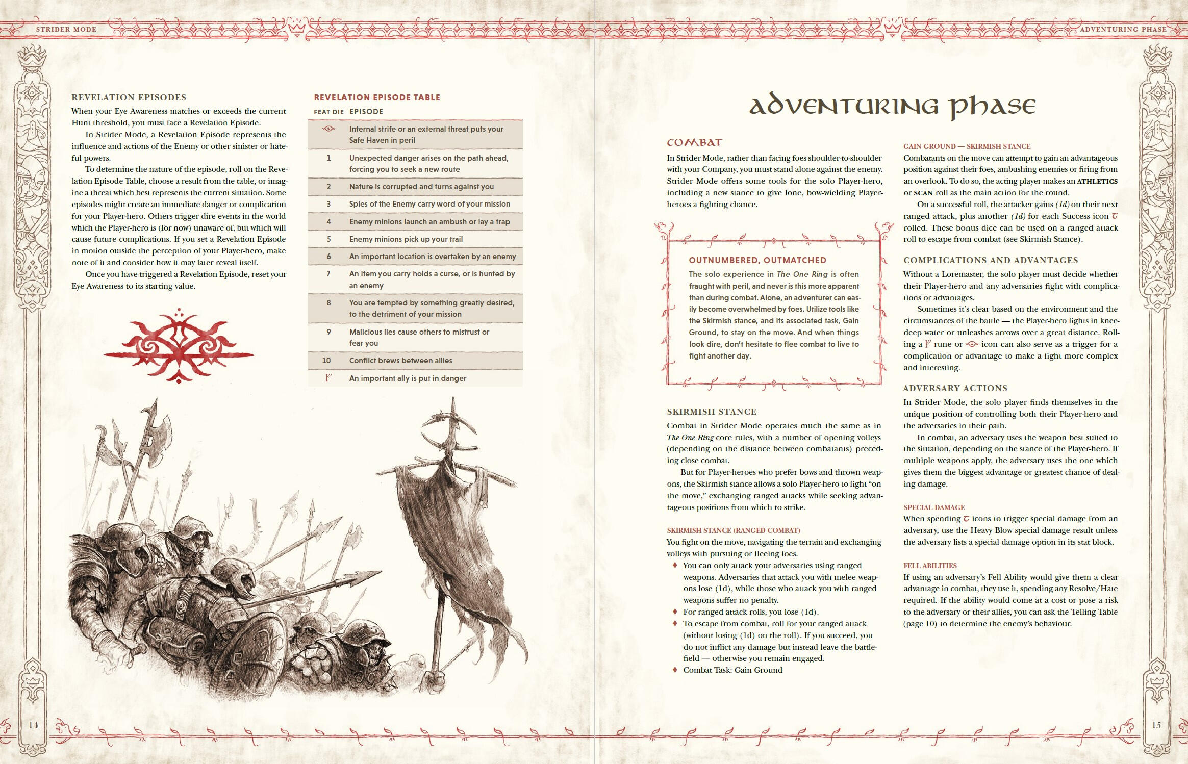
Below is a screenshot from The One Ring's "Strider Mode" PDF. Its strong columns, use of different fonts and colours for headers, and visual elements around tables and outboxes confidently signpost where a reader's eye should be drawn.
To a screen reader, these visual distinguishers don’t translate over. All text looks the same, using one of several tags.
Below is the same page from the previous example, but highlighted to show how content on the page might be tagged.

For a screen reader, these different pieces of content are instead distinguished using tools like links, bookmarks, articles and special tags. How you set these up are covered later in this guide.
For now, just make sure you’re tagging your headings and paragraphs, wherever they are on your page.
Size doesn't always equal Tag
Visual design culture has connected heading tags with the physical size of text on a page; <h1> should be the largest, <h2> the second largest, etc.
For most documents, this logic holds true. In fact, assistive features such as character interpretation and auto-tag may take into account the size of text on page when assigning it a heading level.
However, some aesthetic choices can lead to confusion. Below is an example of this in action:

Visually, the emphasis is on the project title, Carved in Stone. The phrase ‘introducing’ is there stylistically, only considered once the reader’s eye is dragged in.
For visual consistency throughout this website, blanket styles have been set to each heading level. The phrase ‘introducing’ uses <h3>'s style, while the project title uses <h1>'s style.
This can be confusing if we're reading document using an SR. Without being able to see the layout, we might think important information hasn't been tagged properly when we're moved directly from ‘introducing, h3’ into ‘Carved in Stone, h1’. We might waste time using other tools to search for seemingly untagged content that isn't actually there.
Where possible, text should be tagged depending on its functionality, rather than its aesthetic. In this example, both "Introducing" and "Carved in Stone" should use <h1> tags.
If you can't manually tag your text, you should try to use styles that best fit the hierarchy. In this case, the banner doesn't use the "Introducing" kicker above the main title.

3.2 Creating Lists
Lists are set up using a paragraph style, just like regular text.
Instructions: Setting up Lists
Make a paragraph style, and go into the Options panel.
Click on the Bullets and Numbering tab. This the official list function for InDesign, and the only way to make sure your lists include their proper tags.
Find the List Type field, and select either Bullets for an unordered list, or Numbers for an ordered list. Both will export with tags.
Now go into the Export Tagging tab. Make sure that the EPUB and HTML, and PDF fields are set to [automatic]. If set to anything else, they will override the list tags with the option entered here instead, and your lists won’t work.

Custom Bullet Characters
You can use the "Add" button in the Bullet Character field to use any specific glyphs from any installed font as a bullet point. This custom character will be entered into the <Lbl> tag, so screen readers may not be able to interpret it if it isn't a standard unicode character.
This can easily be fixed post-export by applying a standard unicode bullet point as Actual Text to the <Lbl> tag. There's a tutorial about how to do this using Acrobat Pro in 3.9 Checking Your Work.
Nested Lists
Lists can contain more lists. These are called Nested Lists.
In InDesign, nesting lists are set up using a combination of different paragraph styles.
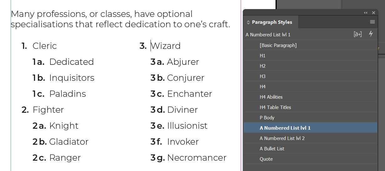
On the page, nesting lists create a visual hierarchy that the eye can follow. However, in PDFs, there aren't level specific list tags like headers have with <h1> and <h2>, only lists contained inside of other lists, like so:
Most screen readers can only read one list at a time; they don’t automatically create contexts between lists. Therefore, to make sure nested lists can be moved through easily without getting confused, we need to create a clear hierarchy throughout the labels for all list items.
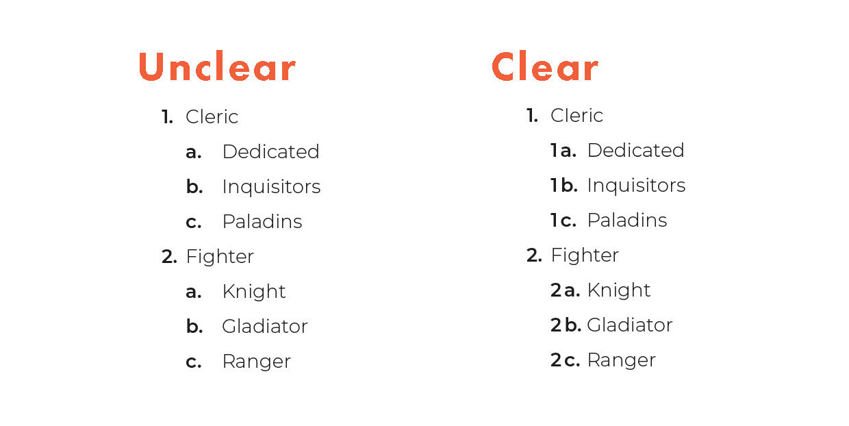
Instructions: Setting up Nested Lists
Start with your first list’s paragraph style (e.g. 1, 2, 3).
Note: it will need to have a List Type of "Numbers". "Bullets", also known as unordered lists, won’t work.Duplicate your first list, then rename it. This will become your second, nested list.
Go into the Options panel for your nested list, and then into the Bullets and Numbering tab. Find the Level field, and change it from 1 to 2. Similar to heading levels, you’re indicating that this new nested list is more specific.
Go to the Number field. This uses InDesign specific code to determine how your list’s labels (e.g. 1, 2, 3 ; a, b, c) are generated.
Click the little arrow to the right of it, click on Insert Number Placeholder, and choose Level 1. This adds a dynamic reference into the Numbers field, meaning it will pull in the label from any Level 1 List directly above it.


Combining your regular and nested list styles, you can create lists with labels that will update as you use them, and that will translate those labels into the exported <Lbl> tags for your document.
3.3 Object Export Options
As explained in 2.2 Objects and Alt Text in PDFs, for the purposes of accessibility, an Object is broadly anything that isn’t text.
This could be a graphic, a vector illustration, a decorative element on the page, a rasterized section of text, and so on.
Objects can also be groups of complex content that’s easy to understand when seen, but hard to navigate through with a screen reader, such as diagrams, flow charts, and ornate typographic elements.
Objects will only show up to assistive technology if they're tagged properly, and even then, they’ll need to have attributes like alt text or actual text to describe what they are. In InDesign, this is done through the Object Export Options panel.
Instructions: Applying Alt Text
Alt Text, or Alternative Text, is an attribute that describes what an object is. The next guide (3.4) goes over how to write good alt text. For now, we’ll focus on how to apply it.
Right click your object, and select Object Export Options.
Go to the first tab, Alt Text.
Here, you can select the source for this object’s Alt Text. Select “Custom”.
Now you can enter Alt Text into the text box field below.


Grouped Objects Alt Text
Objects can be grouped together. While grouped, they will keep their alt text values and be exported with them. When exported, each item within the group will appear as an individual object.
If a group is assigned alt text, its individual parts will be exported as one single object, and only the group’s alt text will be exported.
Tip: Copy In
If possible, make a copy of your original manuscript for your document and write your alt text into it.
You can use features like spell check to keep your alt text legible, and reference this document for any alt text you produce without having to open InDesign. This is especially useful when repurposing alt text for other uses (such as posting on social media).
Furthermore, once you've created alt text for your whole document, you'll have a version of your manuscript that you can quickly turn into a rich text companion document.
XML and XMP
Some files can have Alt Text written elsewhere, which can be pulled into InDesign the same way you link images into your layouts.
Both XML and XMP sources are highly technical, and it's unlikely you’ll need to use them.
While pulling pre-written alt text can be a useful feature, most images in TTRPGs will need specific alt text, especially if the same image is used in multiple places. This is talked about more in 3.4 Writing Good Alt Text.
Instructions: Applying Artefact Tags
Artefact tags will tell assistive technology to ignore an object entirely. This is useful for elements like repeating decorative artwork that doesn't need to be described.
Right click your object, and select Object Export Options.
Go to the second tab, Tagged PDF.
Go to the Apply Tag field, and select Artefact.

As with alt text, a group of objects can individually be a mix of different tags, but if a group is applied an artefact tag, all objects within the group will become a single artefact.
3.4 Writing Alt Text
Writing alt text is a form of translation, turning a piece of visual media into text.
This might be a description of what exactly an image is showing, or it might give a more general ‘sense’ of what the visual aspect is conveying.
You don’t have to look very hard to find many different guides to writing alt text. The following tips work for most images, but this advice is more suited to tabletop roleplaying games.
If in doubt about how to approach describing an object, ask others in your community (especially visually impaired people), and follow their lead.
The length of your alt text should match the pace of your media
There are many reasons why we have graphics in a document. For example, some artwork can be essential to adding context to accompanying text, while other illustrations are added to set a general tone, or even just to fill empty space.
How long and how detailed alt text should be depends on the graphic and its importance. Most objects fall into four basic size categories, but these are guidelines rather than hard-and-fast rules:
Short. A line or two. Usually for spot illustration, simple images, a single panel of a comic, or a repeated image.
Medium. A few sentences. For images conveying information, like an establishing shot, an action scene, or a half page.
Long. 1 to 2 paragraphs. For very important images that are intended to be studied for some time, establish an ongoing tone for the next part of the document, or images where understanding many elements is necessary to appreciate the content. These include full page illustrations, important diagrams, or maps.
Very Long. 2 to 4 paragraphs. Reserved only the most important and finely detailed illustrations, like the front cover of a book.
The longer a piece of alt text is, the longer a reader will need to dwell on it, and not on the content it is accompanying.
Repeated images don’t need to have to use the same full-length alt text each time. Consider if it can be mentioned in reference. If its original purpose has changed, it will likely need new alt text.
Be descriptive, but clear
Simplicity and clarity are important factors. Consider these two examples:
Illustration of a sleek, bipedal creature with webbed feet, brilliant white plumage, and a bright rostrum.
Illustration of a white duck.
While the first example is certainly descriptive and technically accurate, it is inefficient and misleading.
It also fails to help a reader who doesn’t understand what the alt text says, such as for whom English is a second language. Googling “bipedal creature with webbed feet” returns many different animals, including platypus, beavers, otters and water opossums. Googling “Duck” provides a definition of what a duck is.
Label the original format
If your document contains lots of different formats of image (such as camera photos, illustrations, animated GIFs), label them as such. For example:
Polaroid photo of a dark room...
Oil painting depicting two women who are...
Three screenshots, each a step of section 3a. The first screenshot shows...
A cropped digital illustration...
Describe layouts
If a page's composition is intended to add to how text is visually read, add alt text to highlight this. For example:
Layout description for pages 12 and 13. An illustration of a whale skeleton spans both pages. Each item on the following list highlights a relevant space inside the skeleton, from its skull to tail.
Keep transcriptions accurate
When transcribing text of any kind (such as flavour text, or read aloud text), try to be as faithful to the original material as possible. Avoid contracting or summarising text.Visual impairment is a sliding scale, and readers who are partially sighted may be comparing between the original image and the alt text for clarity. You will confuse your readers if these two sources don't match.
Match your source material's tone
The way you write your alt text should imitate the material it's coming from.
If it's appropriate for your document, try to have the alt text copy the tone of the rest of the content in your book. If you were writing a game about talking animals more geared towards children, you might describe an illustration in a more playful way than you would perhaps for a darkly themed war game.
Similarly, the alt text you write should match the reading level of your document. Alt text should fit seamlessly in with the other prose, not be insultingly simple nor frustratingly obscure.
Describe visual cues in your alt text
We don't have to physically see something to know that it can be communicating something important. Visual cues often communicate cultural norms and subtle messages. These can include descriptions of texture, uses of colour, and recognisable artistic styles.
For example, a “pale, gaunt woman wearing a tattered white dress” has a ghostly connotation in western imagery. Comparatively, a “pale, gaunt woman wearing a tattered yellow dress”, while certainly odd, is not as ethereal.
Avoid writing your interpretations
Refrain from describing what can’t be seen or easily inferred from the image, like internal imagined dialogue. Consider this alt text:
Digital illustration. A painting of a woman wearing a fashionable red dress. Her hair is tied back into a bun. Her neck has several tattoos, and she is wearing a single emerald earring on her right ear. Her red dress is symbolic of her anger, and her tattoos show she belongs to an elite cartel of assassins.
The first half of this alt text is good: accurate, concise, and descriptive.
The second half is not. The colour red can have many different meanings, and a viewer wouldn't automatically assume that someone with tattoos is an assassin.
Alt text is not the place to give extra information which isn’t found in the original image. Alt text that’s rambling, confusing, or filled with commentary makes understanding the original image difficult.
Alt text can include established information
If certain information has already been established, it’s okay to also include it in your alt text for the sake of pacing and brevity. Compare these two examples. They’re both written for the same image, but as if it had been placed at different parts of the same book.
Placed at the beginning, first introducing this character.
Digital illustration, mimicking grand baroque painting styles from the 18th century. This illustration is a painting of a woman wearing a fashionable red dress. Her hair is tied back into a bun. Her neck has several tattoos, the most prominent of which are three starlings overlapping each other in flight. She wears a single emerald earring, which is set in gold. At the bottom of the painting is a name plate, labelled “Isabella”.Placed in the middle, after a dramatic reveal.
A painting of Isabella, wearing a fashionable red dress. Her hair is tied back into a bun. She is showing her neck, prominently displaying her Swallow Clan tattoo. A shaft of light causes her earring, set with Shin’s sacred emerald, to sparkle luciously.
The first example is more detailed. It establishes the aesthetic style of the artwork, and draws our attention to Isabella's most striking features.
The second example relies on previously established details. It doesn't reference the style, because it's stayed the same throughout the book. It references things we as a reader already know from the text, such as Isabella's name and Shin's emerald, but have little meaning if accidentally encountered early.
Try to involve the original creators
Working with an artist on their image’s alt text can help translate their original intent without the risk of misrepresenting it.
Artists may have created characters with specific genders in mind, or included elements with cultural meaning that a secondhand writer may not understand. Equally, they may have left certain aspects vague, and a secondhand writer may ascribe meaning where none was intended.
Describe repeating and/or background elements
Visual elements like page textures, ornate decorations, and stylised fonts can all play a part in the aesthetic of your game. Describing these elements when they first appear will help immerse SR users.
You don’t have to reintroduce them every page, but mentioning their presence if they are reused is advised.
Read your alt text out loud
As an exercise, try reading your alt text out loud, as if you were describing it to a friend on the phone. Would they be able to imagine what you’re describing?
Read other creator's alt text
If you're not sure how to describe something, check to see if there are any similar examples you could work from. These don't have to be from the genre of your original work. For example, if you're trying to create alt text for a sequence of images, you could try looking for tagged comics or graphic novels to get inspired.
3.5 Creating Tables
In general, tables of any kind are hard to make accessible. The tags and attributes used to describe tables aren’t adequate enough to communicate their information to assistive technology, and there are so many opportunities for tables to break even if all of the important steps are followed.
Our first suggestion for creating an accessible table is to consider if it could be a list instead.
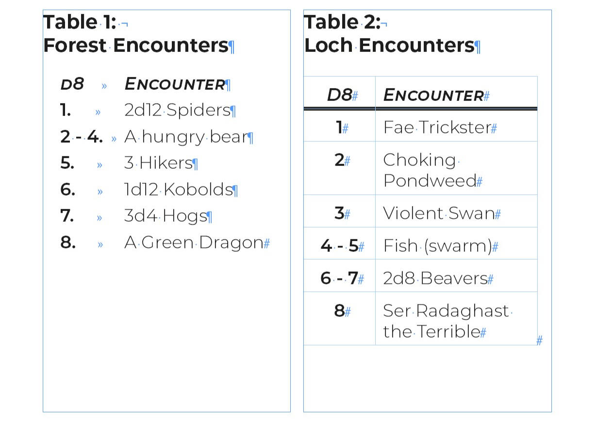
Most tables in TTRPG documents are for generating random prompts (e.g. 1d20 monster encounters), and can be easily presented as one or more well designed lists.
Below are two examples. The first is a list using tab indents to create pseudo-columns. The second is a simple table where the information is explicitly communicated.
If a table is absolutely necessary for your document, you can follow these instructions to create a simple table.
Instructions: Creating Simple Tables
Go to the Table menu and use the Create Table function.
Enter the number of columns and rows you need, plus 1 Header Row.

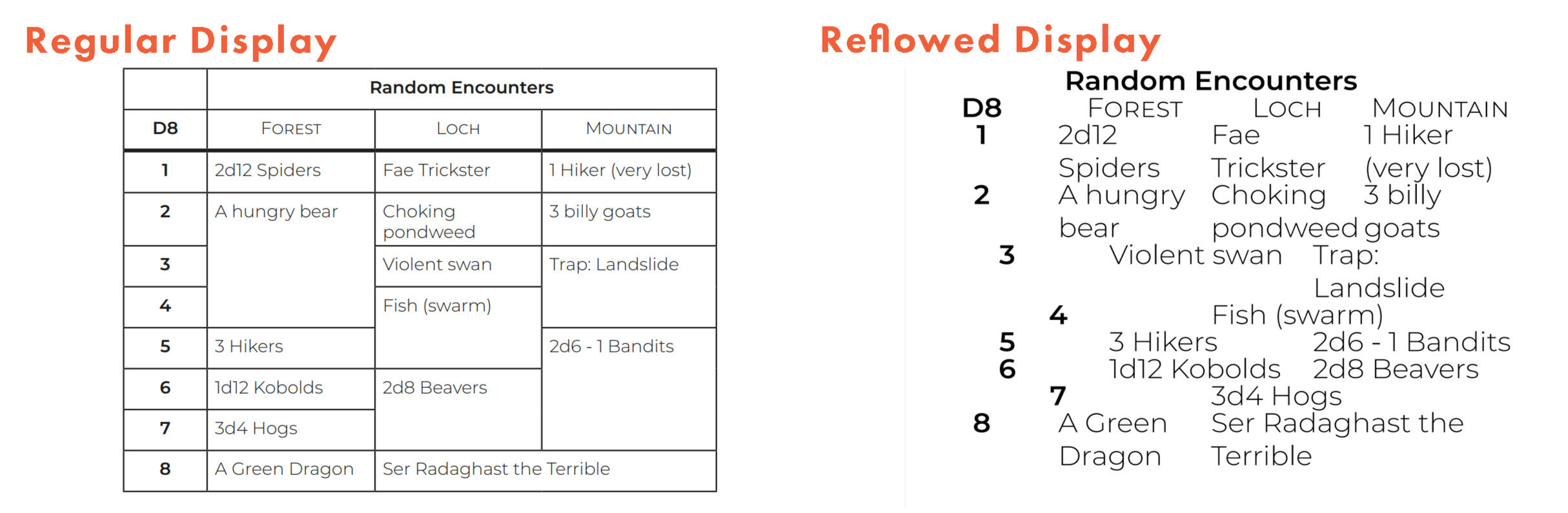
Fill empty cells with a dash (-)
If you don’t enter content into a cell, its exported tag will be empty. This can lead to unexpected formatting changes for users of assistive features like Reflow.
Empty cells will collapse into nothing, and previously spaced out content will squish together. Compare these two examples to see what happens.
Row Header Cells and Complex Tables
Unfortunately, Adobe hasn’t provided the tools needed to assign Row Headers or create accessible complex tables in InDesign.
To do either, you will need to manually add or fix tags using a PDF editor like Adobe Acrobat Pro. There’s a thorough video tutorial here that can walk you through how to do this.
We recommend you only do this on final documents — if you need to update and export your files, you’ll also need to redo all of this work from scratch.
3.6 Defining a Reading Order
Visual readers have many different cues that inform them of how to read the content on a page, and in what order.
Some of these cues are naturally assumed. For example, English speaking readers will move from left to right and top to bottom through a document.
Other cues are visual. Eye are drawn to larger elements first, and smaller elements second; broader columns of text are often related to but distinct from smaller sidebars; and so on. For the most part, good visual design instantly communicates a page's reading order.
Translation issues
Unfortunately, these visual cues aren’t translated to a file's code. When auto tagging an exported PDF, InDesign will order the lowest layer’s lowest item first, and continue up through to the highest layer’s highest item last.
This creates an immediate problem. When assistive technologies try to navigate through a page from lowest item to highest item, they most likely won’t engage with the content as the author or designer ever originally intended.
One tedious solution is to organise all of the content in your page items in InDesign by the order you want them to be read, as one single layer. Of course, this creates a hundred more problems by restricting how you overlap images and text, use layer effects, and so on.
The best solution is to instead use the Articles Panel to define a specific order for assistive technology to navigate through your content, and to Anchor relevant objects directly into text boxes.
Instructions: Setting up the Articles Panel
Go to Windows/Articles to open up the Articles Panel
Click the Options menu and make sure “Use for tagging order in tagged PDF” is selected.

This second step is important. This setting is off by default in every new document. With it selected, exported PDFs will tag content in the articles panel, and organise it into the order you set.
Any page items left out of the articles panel won’t be added to the PDFs reading order, and won’t be included in an EPUB/HTML export. This is good! Its a second measure, alongside artefact tagging, that ensures superfluous content won’t bog down assistive technologies.
Instructions: Creating Articles and Organising Page Items
Create a new article by clicking on the boxed plus icon and the bottom of the panel, or by dragging a page item from your layout into an empty part of the panel.
Name the new article. This name will be visible inside the PDF, so choose something that will summarise the page items they contain concisely.
Add page items to an article by dragging them from the layout and into the panel, or by selecting the page item and then clicking the unboxed plus icon.
You can add all items from the currently selected page by ctrl-clicking the unboxed plus icon.
Rearrange the order of page items by dragging them up or down. Items can only be placed within an article, and they can’t be nested.

Articles are essentially folders. Each article can contain any kind of content, such as text boxes, local objects or frames. Articles cannot be nested inside of each other.
When exported correctly, articles create a linear thread throughout a document for assistive technology to follow, guiding it from article to article, and processing page items within an article from first to last.
Grouped Items
You can add a group of items as a single unit into the articles panel.
If the group does not have alt text, its reading order will go from lowest item to highest item. If the group has alt text, it will export as a single object.
If you have two (or more) text boxes threaded together, so that text from the first overflows into the second (and so on), they will appear as a single page item in the Articles panel.
This means you won’t be able to place other page items in between these different text boxes. If you need to, either break the text boxes up, or Anchor other objects into the threaded text boxes.
Consistent Formatting
Your articles can be structured by whatever groupings of content makes sense for your document, such as chapters (E.g. Class: Fighter) or pages (Page 23 & 24).
When readers look at the tags of a document, they will see the articles as you've organised and named them. For your own consistency, stick to a single grouping structure if possible.
Moving around
Articles can contain page items from different pages, regardless of if they’re facing.
There’s different situations where you’d want to do this, such as directing a reader to a diagram that’s on the opposite page in your document, but relevant to the current text.
Considerations like this can raise your document from simply being “accessible” to being a more easily used resource.
However, when using this feature consider how you’re impacting the reading flow of your document. For example, if you direct readers out from the middle of a section to the end to look at an appendix and then bounce them back, perhaps instead consider in-text bookmark links that describe where they’re going and why. That way, a reader gets to choose if they want to keep reading the current section, or look at the appendix.
Tab Order
When exporting your a PDF, select “Use Structure for Tab Order”. This feature allows readers to use the tab key to move through your PDF using the Reading Order you’ve established with the articles panel.
This feature isn’t used by many assistive technologies, but is available by default within most PDF readers. It can help readers that fall between being visually impaired and sighted, such as dyslexic readers, and be useful for form-fillable PDFs, such as character sheets.
Instructions: Anchoring Objects
Select your Object.
Look for the filled square, located between its top middle and top right manipulation points.
Click and drag from that square into the text frame, to the location you’d like to anchor the object.

An anchored object will be interpreted by assistive technology only once its anchor is encountered in that text. This is useful for making sure an object is encountered at the right time.
Because anchored objects are directly tied to a specific reference point inside a text frame, they can’t be added into the articles panel.
Anchoring breaks Text Wrap
It is a well documented (and long unfixed) bug that anchoring an object will cause problems with the text wrap feature. You can see similar complaints on InDesign's feature request forum.
Currently, if you anchor an object with text wrap into a body of text, then the text wrap will only apply to text past the anchor point. Any previous text will not wrap, but instead display over the object.
3.7 Creating Navigation
There are several similar tools you can use to help readers move around your document.
Options like Hyperlinks, Cross-References and Bookmarks will help your readers move to specific content quickly, before returning to the beaten path set by your Reading Order.
Furthermore, adding File Metadata will help anyone to find your document quickly when searching for it on their computer.
Instructions: Adding Hyperlinks
Select text you want to hyperlink. Try to use text that is self explanatory (e.g. for the text “click here to go to page 55”, select “page 55” to be hyperlinked, and not “click here”)
Go to the Hyperlinks panel (Windows / Interactive / Hyperlinks).
Click the boxed plus icon on the bottom right corner.
Use the Link To field to choose what kind of destination the hyperlink will have.
Enter the destination for this hyperlink. This will usually either be a web address, a page, or a specific text anchor.


Link Alt Text
While Alt Text can be applied to an image via the accessibility tab, it isn't reliably read out to most SR users. Therefore, all linked text really needs to be self explanatory.
This may change in the future, so it is still good practise to apply alt text, making sure to keep it concisely descriptive of the link's target destination.
Hyperlink Destination Options
URLs. Link directly to a web address.
Files. Link to files on your computers storage. These links will break if moved out of their original context, which is very easy to do (e.g. renaming the linked file, moving the linked file to a new location, opening this document on a different computer, etc).
Email. Will open the users local email app (e.g. Outlook), and start a new email to this email address. You can also enter a custom subject line for this email.
Page. This will be a specific page in your document. You can also set how zoomed in the page should be when the user jumps to this new location.
Text Anchor. This links to a specific, pre-established section of text.
Shared Destination. An InDesign specific feature allowing you to reuse a hyperlink from elsewhere in your document. Even Adobe admits this is likely to break, so we don’t recommend using this feature.
Instructions: Creating Text Anchors
Select the Destination Text.
Go to the Hyperlinks panel, go to the options menu, and select New Hyperlink Destination.
An anchor’s default name will be the selected text. You may want to change this if you plan to have use many different anchors throughout your document.


Text anchors are sections of text that act as reference points that hyperlinks and cross-references can point to.
Bookmarks cannot share the same name as text anchors. Text anchors aren’t normally visible to readers, so you can rename these however best suits your workflow.
Instructions: Inserting Cross References
Open the Cross-References panel (Window / Type & Tables / Cross-References).
Move your text cursor to where you would like to insert a Cross Reference.
Click the boxed plus icon on the bottom right corner.
You can choose to reference an existing Text Anchor, or a specific paragraph of text. For the latter, you can search for it first by paragraph style, and then through each paragraph currently using that style.
You can customise the format of your page reference, similar to customising labels in Numbered Lists. InDesign has several templates, which you can duplicate and customise. You can also assign character styles to each page reference template.


Cross-References are dynamically updating hyperlinks. You insert them into your text, and link them either to an existing Text Anchor, or a specific section of text. Like hyperlinks, readers can click cross-references to jump to the linked content.
As the document changes, your cross references will update. For example, you could insert a cross-reference directing readers to the Wizard Spell List on page 55. Later, if you decide to move the Wizard Spell List to page 67 and rename it to the Sorcerer Spell list, your cross-reference will automatically update to reflect both changes.
Instructions: Creating Bookmarks
Select the text you want to bookmark.
Go to the Bookmarks panel (Window / Interactive / Bookmarks).
Go to the options menu, and select New Bookmark. It will appear in your Bookmarks Panel.
You can use the options menu to rename bookmarks. (Alternatively, select them and then click once on the name.)
Rearrange bookmarks by dragging them around within the bookmarks panel. Dragging a bookmark onto another will nest it inside, making a folder. Bookmarks can be nested multiple times.

Bookmarks are essentially "static links to a text anchor" by another name. Unlike regular links, they show up in the bookmarks panel in most document viewers.
They are used by many readers, and are often not considered an accessibility feature in the same way most don’t consider glasses a kind of disability aid. However, readers using assistive technology appreciate them greatly.
When creating bookmarks, make sure to select text at the beginning of a clear section, and to rename them to something concise and descriptive if the anchored text is too vague or out of context.
Instructions: Creating a Table of Contents
Create a new text frame, or enter into an existing one where you’d like to enter your TOC.
Open the TOC Wizard (Layout / Table of Contents).
Choose which paragraph styles will be added to the Table of Contents.
You can assign new paragraph styles to these entries. This will standardise the look of the items in your table of contents.
Decide if you want to use "Create PDF Bookmarks" or "Make text anchor in source paragraph" options.

Create PDF Bookmarks
This option will generate new bookmarks for your document, using the exact text referenced from each item in your table of contents. These will slot in alongside any existing bookmarks that you have.
This is a helpful head start if you’ve yet to create bookmarks for your document. However, make sure to go through them thoroughly, as some bookmarks may need slight renaming to make their destination clearer, and some bookmarks may be more functional if nested under larger sections.
Make Text Anchor in Source Paragraph
This option will generate new text anchors for the original text each item in the table of contents is drawing from, and create a hyperlink for each item to that new anchor.
This is very convenient for generating links for all of your table entries very quickly. The anchors generated will use a unique coded format (e.g. _idTOCAnchor-1) so as not to conflict with any existing anchors you’ve created going to the same places.
Updating a Table of Contents
The entries that the TOC wizard generates are assigned static hyperlinks, not cross-references. While their links are to text anchors and those anchors will persist if the pages change, the actual page references in your table of contents won’t update dynamically.
Using the Layout / Update Table of Contents function will generate a new table of contents to replace the old one, in the same location and following the same rules set up in the wizard. This will update all of the links and add any new entries that have been created since the last TOC was generated, but it will also undo any custom formatting or changes to the text you’ve applied.
Tip: Plan your TOC with your Reading Order
You can double up your efficiency by creating your Table of Contents as you go through to apply your Reading Order with the Articles panel.
Create duplicates of your headings' Paragraph Styles, and add an obvious label to their name (e.g. "H1 Title" becomes "TOC H1 Title"). As duplicates, these styles should be linked to the original styles, and mimc any changes you make to the originals (such as tweaking kerning, and so on). Finally, add these duplicate styles to a specific folder labelled "TOC References".
As you go through your document applying your Reading Order, you can also apply these identical styles to headings that you want to have in your TOC. When you generate your TOC, reference these duplicate styles, not the original headings.
This lets you have fine control over the contents of your TOC, and allow you to update it without having to prune out unwanted entries that share a common style.
Instructions: Adding File Metadata
Open the File Information panel. (Edit / File Info).
Add a Document Title and Author information in the Basics tab.


3.8 Exporting Tagged PDFs
Here’s a quick list you can run through to see if you’re ready to export your PDF.
Basics
Added appropriate tags to your Paragraph Styles.
Created Lists using Paragraph Styles.
Tagged all Objects with Alt Text, or as Artefacts.
Added hyperlinks (where relevant).
Added bookmarks (as appropriate).
No tables used in the document, instead replacing with lists or tagging with alt text.
Advanced
Used InDesign's native Table function to make all tables, used only Simple Tables in your documents, and added Header Rows to each table.
Defined a Reading Order with the Articles panel.
Anchored Objects into text frames (where relevant).
Created Cross-References (where relevant).
Created a Table of Contents (if relevant).
Instructions: Exporting a Tagged PDF
Export your project. (File / Export).
Go to the Save as Type field and select Interactive PDF.
Make sure Create Tagged PDF is checked.
If you’ve used the Articles panel, make sure Use Structure for Tab Order is checked.
Go to the Advanced tab, and switch the Display Title field to Document Title. This means assistive technology will read out your custom file name from the file’s metadata, and not its file path on the computer.
Make sure the language is set to the one the document is written in (E.g. English: UK). This will affect how an SR uses its voicebank to pronounce words


When exporting a PDF, InDesign presents different tools depending on whether you’ve chosen to export an Interactive PDF or a Print PDF.
While the files aren’t any different, InDesign’s Interactive PDF export tools provide extra accessibility options, while the Print PDF tools focus more on colour profiles.
3.9 Checking Your Work
So, you’ve exported a tagged PDF filled with your beautiful work, and using the accessibility skills you’ve developed from these guides.
Before you start spreading the word about your great work, it’s worth giving your exported PDF a quick check over to see if it’s working as intended.
Without being fluent with assistive technology, you won’t be able to fully test if your document works in every way. However, some tools do exist to let you check if the work you’ve done is functional at a basic level.
For this final step, you’ll need access to a PDF editor. We’ll be using Adobe Acrobat Pro, but you can use any alternative that allows you to see and edit a PDF’s tags, like FoxIt PDF Editor Pro 12.
Instructions: Examining a PDF’s Tags in Adobe Acrobat Pro
Note: Adobe updated Acrobat Pro's layout in September 2023.
The old layout is used in the screenshots for this section, but the functions are the same across the old and new layouts. You can still access the old layout via the View menu; otherwise, the location of everything is mirrored horizontally.
Open Adobe Acrobat Pro, and open your file.
Go to the left-hand side panel. (Right-hand in the new September 2023 layout). It’s usually minimised.
Right click, and select Accessibility Tags. This opens the Accessibility tags panel, and adds its shortcut icon to your side panel.

Throughout these guides, we’ve shown you what different kinds of content will look like in their tagged form. Now's the time to see everything put into action. Inside this tags panel, you'll find everything that assistive technology can see.
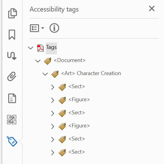
The order of these tags is important as this is the order that assistive technology will make its way through your document.
Clicking on any tag will highlight all of the content it contains, including all tags within itself. In the image below, you can see that this Article <Art> tag has the label it was assigned in InDesign, and contains all of the content for this page.
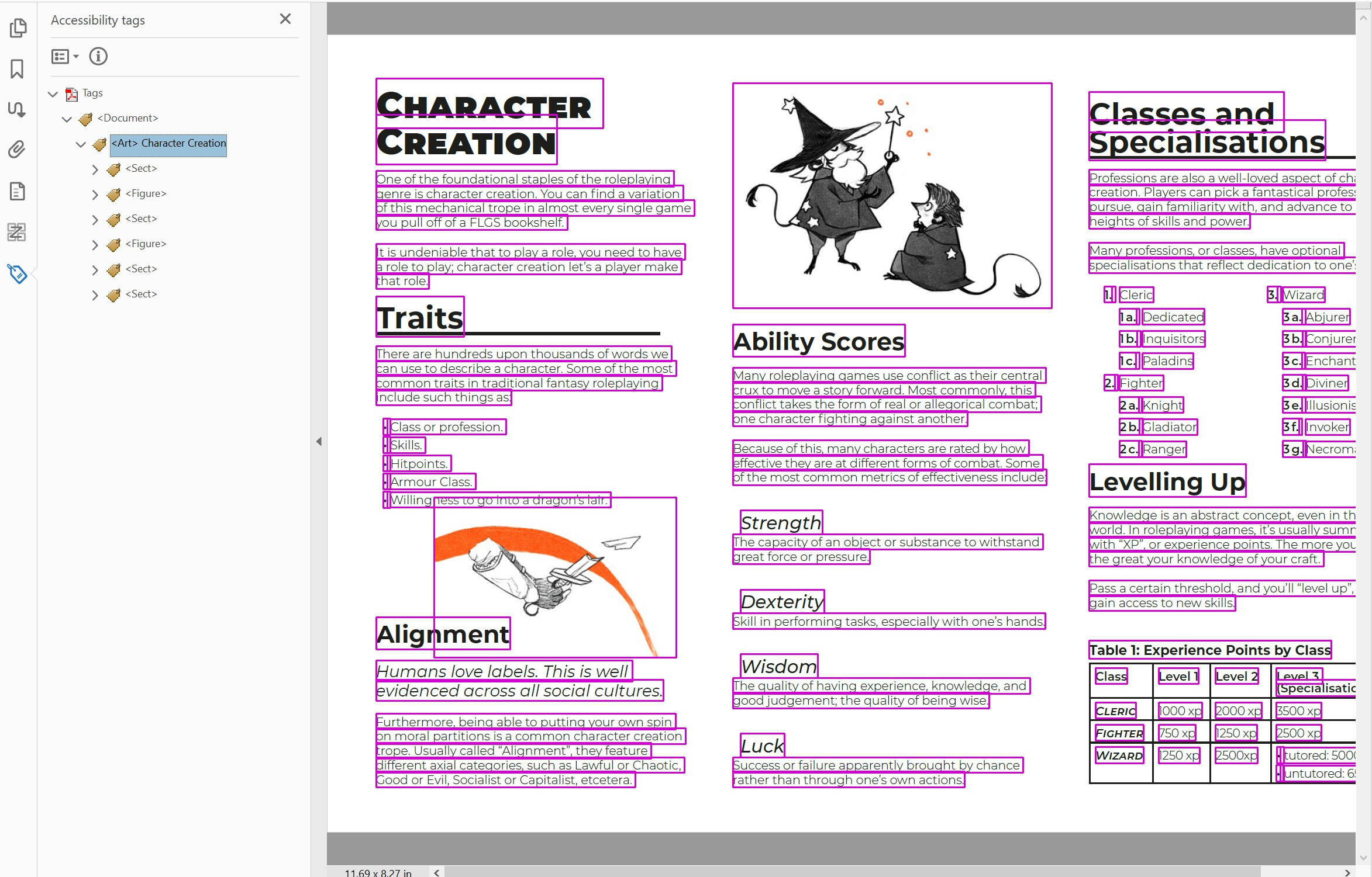
If you keep expanding a tag tree to its end, you’ll find the link to its content. Sometimes this will be a reference to the image included in the PDF, a copy of the actual text as exported from InDesign, or a mixture of terms for grouped objects (such as PathPathPath for a collection of vectors grouped together and given Alt Text).
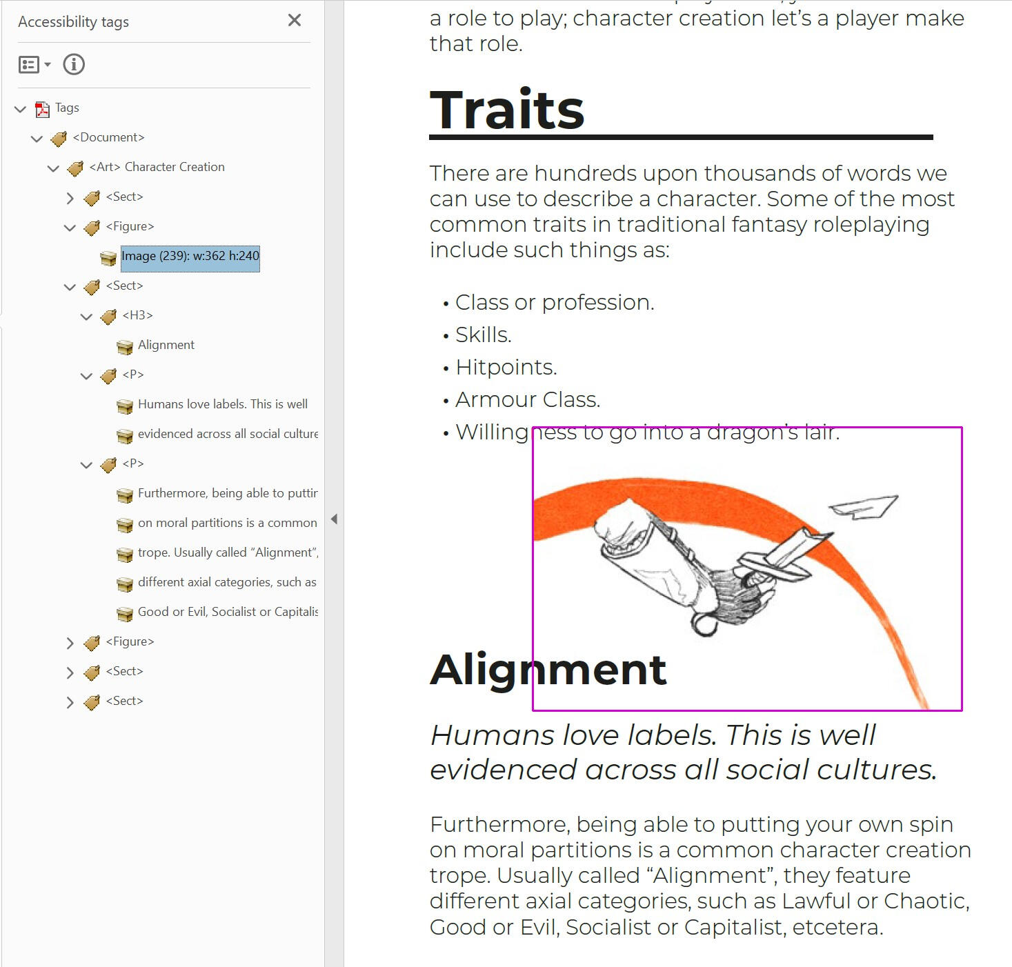
Making Changes
Right clicking on any tag allows us to bring up the Object Properties panel. Here we can see all of the information a tag has been assigned in InDesign, and make corrections if needed.
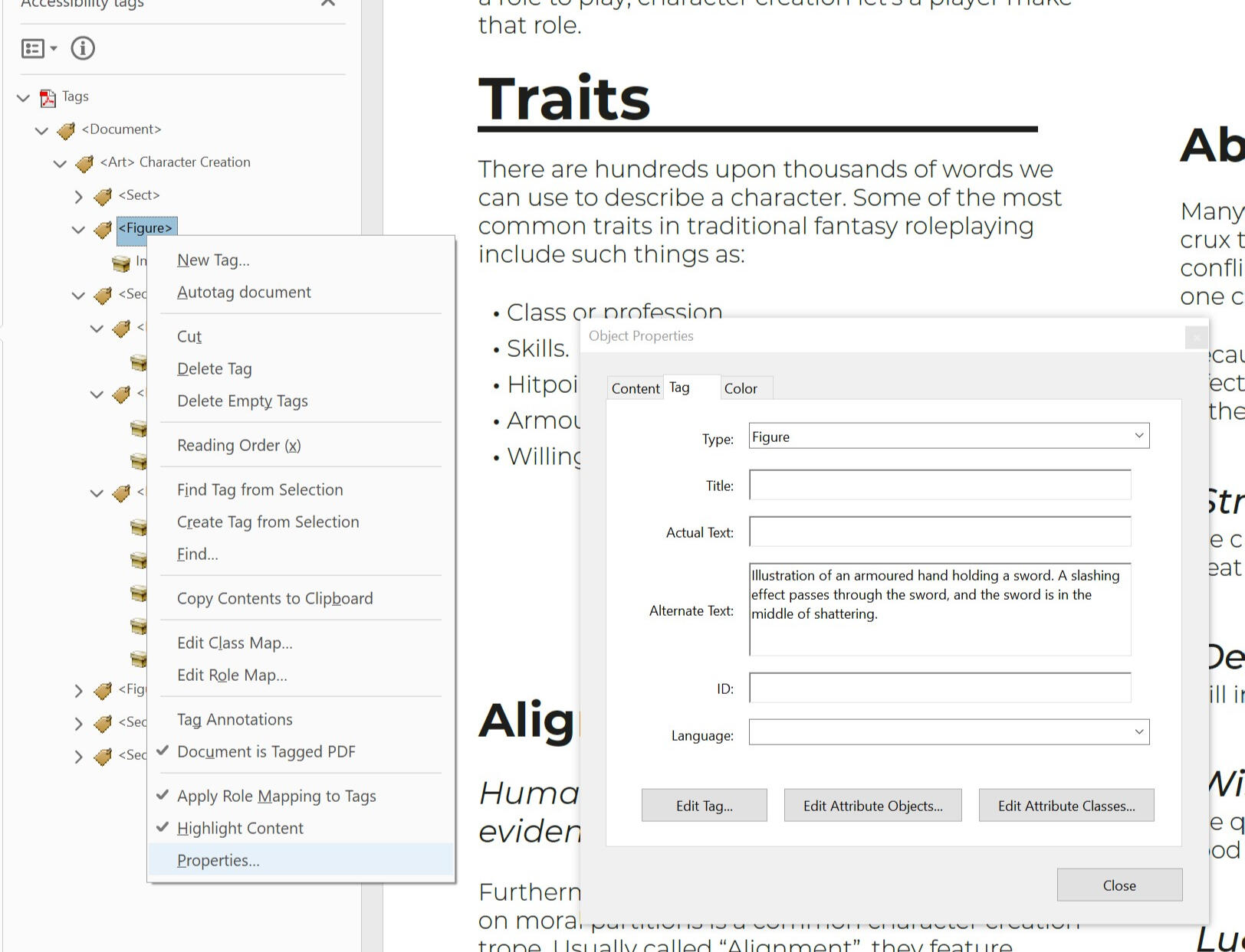
The Object Properties panel will stay open if you click to other tags, and show their content too.
Confirming Changes
When typing in any kind of text, such as actual text or alt text, make sure to hit the enter key to confirm your change. Clicking away from the Object Properties panel may result in you losing the changes you've made. Changes from drop down menus don't need this confirmation.
Changes to a tag are updated live as they are made, so you need to be careful with which settings you fiddle with. Adobe Acrobat has a basic undo feature, but it can be finicky, and has a short memory. Even on powerful computers it may crash Acrobat.
To make any changes permanent, save the PDF.
Note for SR Users. You will need to save your PDF and reopen it, and restart your SR to be able to test if any changes have worked.
Actual Text
Actual Text is a tag attribute that is used to override existing content inside of a tag. Only the actual text is read; all other content is ignored.This attribute is usually used to input the intended visual interpretation of text. For example, when non-standard characters have been used for bullet points, such as right-pointing triangles " ᐅ " instead of a unicode bullet point " • ", or a sentence that suppliments regular letters with unique characters, such as "C@sh" instead of "Cash".Adding actual text to a tag won't change how it is displayed visually. Below is an example of an unordered bullet point list; a standard bullet point character has been added as actual text onto the <Lbl> tag.
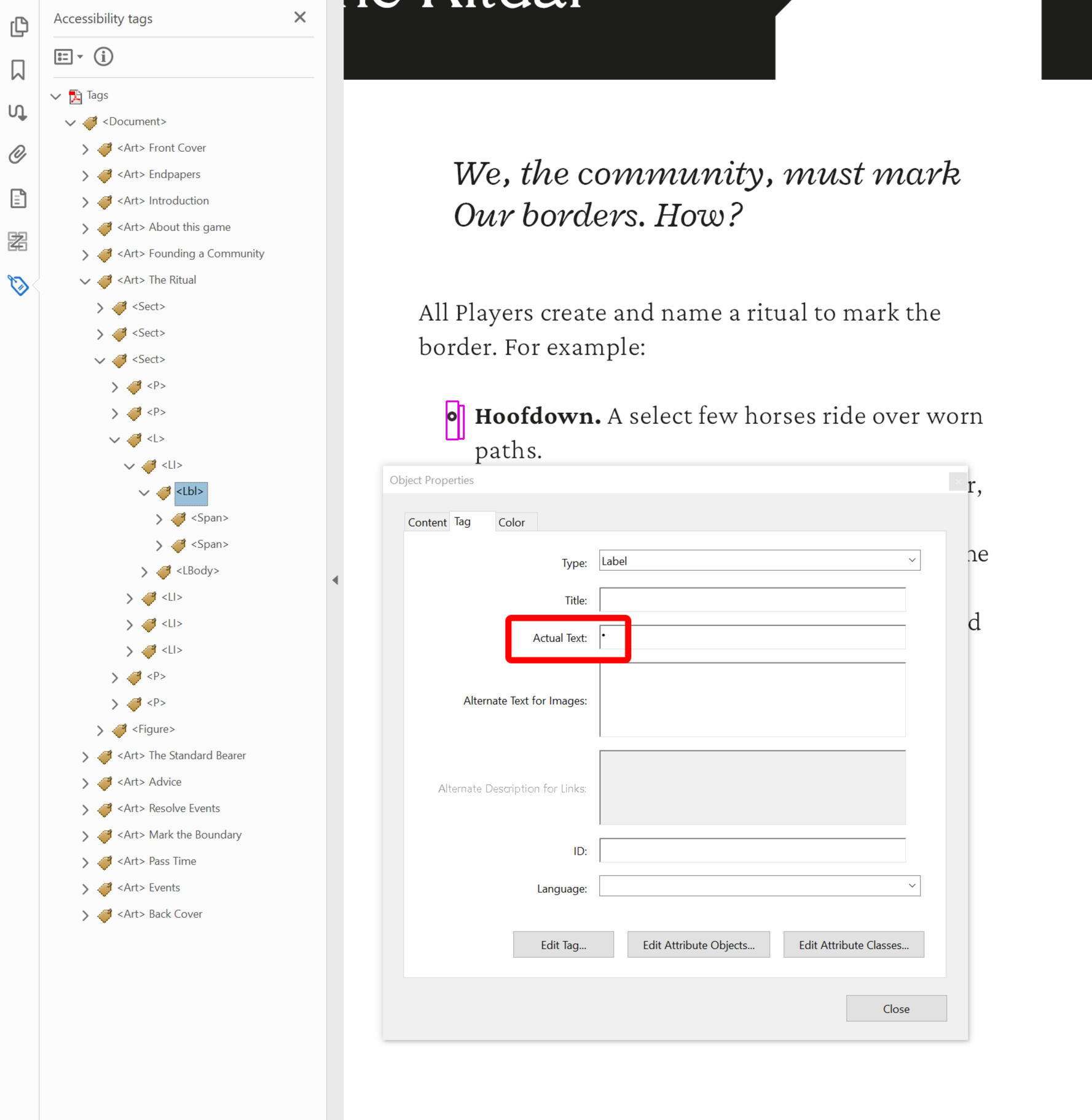
Tip: Making changes to multiple tags at the same time
You can use Ctrl + Click to select multiple tags, and make the same edit to them in the properties panel.
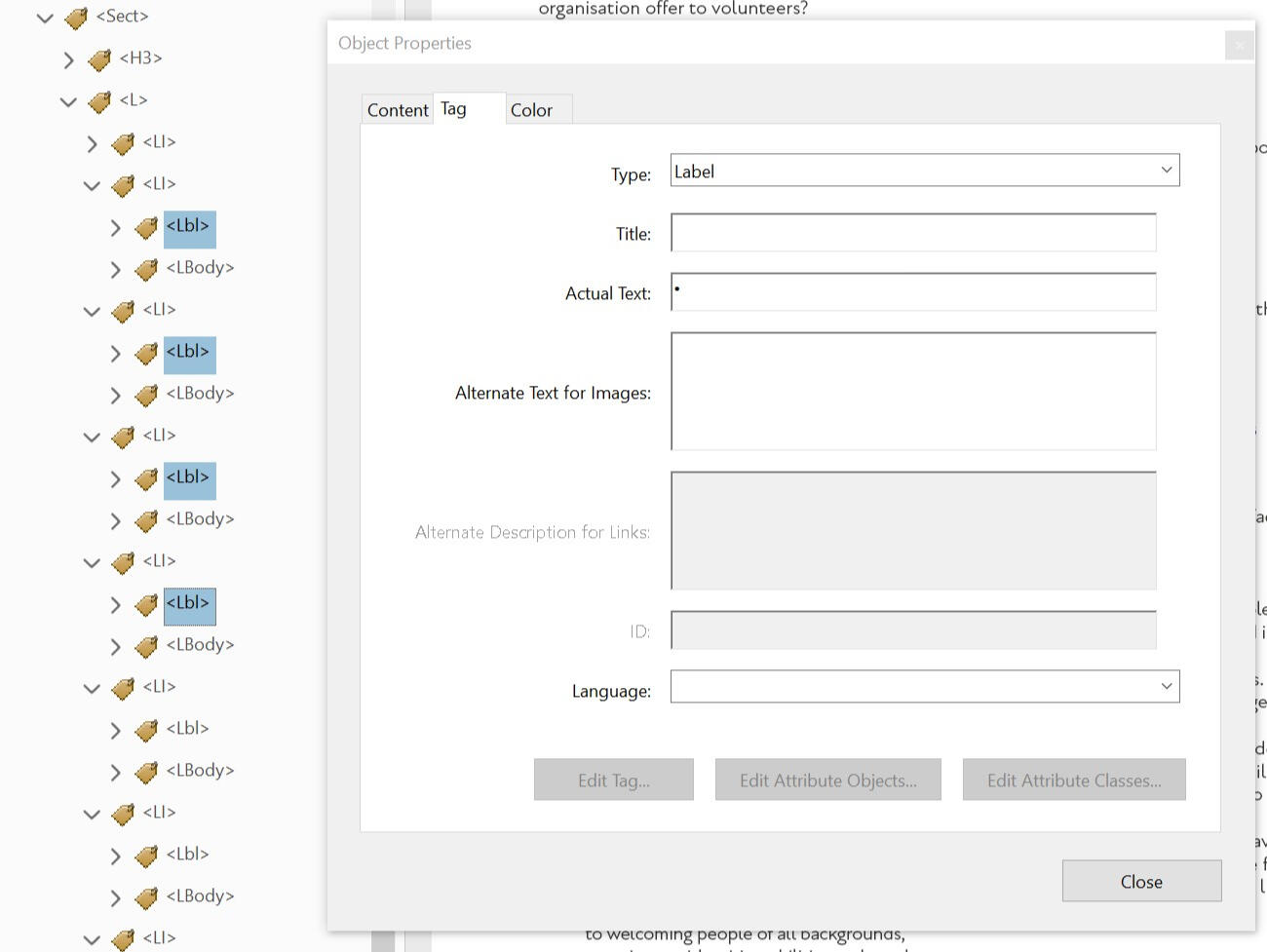
Checking your work
To check your work, start at the top of your document and thoroughly click your way through each tag. Keep an eye on how the highlighter moves through the content of your document, to be sure your reading order is consistent.
Most content will be contained with Article <Art>, and Section <Sect> tags, which keep them thoroughly organised. Expand these to see more specific pieces of content, such as tags for your text and lists.
When moving through your tags, check to see if each tag matches what you’re expecting to be there, such as <L> for lists and <LI> for list items. If something looks strange, such as lists using the <p> tag, it’s a sign that something was likely missed in your InDesign set up.
Fixing errors in Adobe Acrobat is possible, but it can be time consuming. If you find an error, it's better to fix it in InDesign and export your document again, than to fix it in Version 1 and then have to refix it again Version 1.1, Version 1.2, etc.
Acrobat's Read Out Loud
Another tool you can use to check your work in Adobe Acrobat is the Read Out Loud feature.
Go to View / Read Out Loud, and then choose Activate Out Loud. Then scroll to the top of your document, go back to View / Read Out Loud and choose Read To End of Document.
A basic screen reader will then read through your PDF using its tags and reading order. While this feature won’t be able to test more advanced navigation features like hyperlinks and cross-references, it will show you if someone would be able to key directly through your PDF.
You can change the voice bank, volume, pitch and speed (called Words Per Minute) of Adobe’s Read Out Loud in the preference menu, found by going to Edit / Preferences / Reading.
Common Problems
Here are some common issues that Yubi and Brian come across while developing these guides. Read them, and be warned!
My Reading Order is broken!
There are many different steps required to set up the Articles panel to export your reading order correctly. Many of these will also reset when you make a new InDesign document. Speaking from experience, if your reading order is broken, it's usually because "use for tagging order for PDF" wasn't ticked in the articles panel.
If you have a screen reader installed on your computer, like NVDA, Adobe Acrobat may have tried to auto tag your document. It does this to be helpful, and will automatically do this several seconds after you open a PDF, unless it is told not to. When you export an Interactive PDF, InDesign may open it automatically for review, and if your focus is elsewhere Acrobat might rewrite all of your tags. It is super annoying.Adobe Acrobat is also preset to ignore existing reading orders if a PDFs page count is over 50. You can disable this by going to Edit / Preferences / Reading and setting the "Minimum number of pages in a large document" field to a ludicrously high number, like 5000.
Everything looks fine in Acrobat, but it's all broken when I open this in Chrome?
Not all PDF readers are made equal. Chrome is used in the example here as it is the most frequent to break down, but there are other readers out there that won't read accessibility tags correctly.
You can trust that SR users won't be using Chrome to access your documents, so don't worry if it doesn't look right in inadequate software.
So long as your PDF works in Adobe Acrobat, you should be fine.
4. Putting into Practice
There's more that we'd like to do with VAST. This is the next section we'll work, if we're able to secure funding.
We hope to curate a series of case study interviews with different TTRPG designers, conducted by Yubi and Brian.
We'll invite each designer to bring a short section of content from a recent project, and as a group we'll discuss how we might tag it using the tools covered in Section 3.
We'll be looking to focus each interview on a different staple of TTRPG design; monster stat blocks, dungeon crawl maps, read-aloud text blocks, and so on.
Appendix
A.1 Video Transcript: Screen Reader Demonstration
Formatting Note: There are two "speakers" in this video; Brian, and his Screen Reader. The Screen Reader's readouts are in Bold. Relevant descriptions of on-screen actions are in [square brackets].
Transcript Starts.
Brian: Hi! I’m Brian, and this is an introduction to how screen readers work.
This video is intended to help graphic designers and PDF makers, so that they can get a better understanding of what the different accessibility functions of their design software are doing.
It is important to note that I am not visually impaired, nor am I a native SR user. While I have been trained on their use, please see this video as one from a well intentioned guest, not from a figure of authority from the visually impaired community.
This demonstration uses two different screen readers. The first is the NVDA, which stands for Non-Visual Desktop Access. It’s a free piece of software available for modern Windows OS’. The second is iPadOS’ native VoiceOver feature.
In case these features have changed over time, this video was recorded in July of 2023.
So, to start, what is a screen reader? It is a piece of software intended to translate visual content, usually into an audible readout, or into braille. Each screen reader is coded differently, but broadly achieves the same result, similar to how different internet browsers open the same websites. This means the functions you see in this video may differ to how other screen readers work, but their core principals will stay the same.
This is an example PDF I’ve put together to show off the different features of a screen reader.
[As Brian speaks, he zooms in and out and pans around a 2 page PDF.]
Brian: You can see that there’s text, as well as headers, lists, images, and tables across two pages. All of this has been “tagged” using different accessibility functions in InDesign, so that a screen reader can navigate through it easily.
Let’s start the first part of this demonstration, and turn on NVDA.
NVDA: Welcome to NVDA dialogue. Basic screen reading demonstration, Adobe Acrobat Pro. 32 bit.
Brian: As a general rule, when a screen reader encounters a content for the first time, it announces it. Here, you heard my SR read the name of the PDF. We’ll start this demonstration by looking at how a screen reader interacts with text.
NVDA: Heading Level 1. Character Creation.
Brian: My screen reader started with the title. It read out its context – that it’s a heading at level 1 – and then its content; “Character Creation”. SRs move through content along its defined reading order. I’ll quickly key through this document, so you can see its reading order in action.
[A clear rectangle with a magenta coloured outline highlights the content that NVDA is currently focused on. As Brian moves through the 2 page PDF, this box moves each of three columns, targeting fragments of text, headers, lists, items inside of each list, graphics, and other blocks of content. Once he reaches the end of the second page, Brian returns to the start of the PDF.]
Brian: I’ve set the reading order for this document to be what a visual reader would expect. It moves left to right, top to bottom through the columns of each page. Therefore, if I start back at the title, the next thing my SR will read will be the paragraph below “character creation”. When reading text, I can tell my SR to read a whole paragraph at once.
NVDA: One of the foundational staples of the roleplaying genre is character creation. You can find a variation of this mechanical trope in almost every single game you pull off of a FLGS bookshelf.
Brian: I can also tell it to read one line at a time.
NVDA: It is undeniable that to play a role, you need to have a role to play. Character creation lets a...
Brian: I can also tell it to read word by word.
NVDA: Make. That. Role.
Brian: And I can key through words letter by letter.
NVDA: R. O. L. E. Dot.
Brian: Screen readers can jump to specific kinds of content. For example, I can move forwards or backwards through different headings in this document’s reading order.
NVDA: Traits, heading level 2. Alignment, heading level 3. Ability scores, heading level 3. Strength, heading level 4.
Brian: I can also move to specific heading levels. For example, I could go back to the start of this section…
NVDA: Traits, heading level 2.
Brian: ... and I can jump forwards to the next.
NVDA: Class and Specialisation, heading level 2.
Brian: Text can look different and have the same tag. The subsections under Ability Scores use heading level 4.
NVDA: Luck, heading level 4.
Brian: So does the title of this table.
NVDA: Table 1 experience points by class, heading level 4.
[NVDA's focus box moves from a heading to a piece of text before a list. There is no read out, as this is two pieces of footage cut together].
Brian: Next, let’s look at lists. When a screen reader first finds a list, it will declare it and read out how many items are inside that list.
NVDA: List with 5 items bullet.
Brian: An SR can read out individual items within a list, and quickly move up and down through these items.
NVDA: Class or profession. Bullet skills. Bullet hit points. Bullet armour class. Bullet hit points.
Brian: Like with headings, Screen readers can also navigate between lists.
NVDA: List with 3 items 1.
Screen readers will only interpret one list at a time. If a screen reader encounters a second list inside of a first (also known as a nested list), it will read it out as if it is a new list.
NVDA: Cleric. List with 3 items 1 a. Dedicated. 1 b. Inquisitors. 1 c. Paladins.
Brian: It’s important for nested lists to have clear and consistent labeling structures. Without them, moving through multiple lists can get disorientating.
[NVDA's focus box once again moves, as footage is cut together].
Brian: Now let’s look at Objects. Objects are visual elements inside of a document. There are two objects on this page; an illustration on the left, and another in the middle.
These objects have alt text, or “alternative text”. This get’s read out by the screen reader, so that someone who can’t see the object can still understand it.
When a screen reader first encounters an Object, it announces it and then reads out any alt text it has. NVDA declares objects as “graphics”, but other screen readers may use different terms, like figure or illustration.
NVDA: Out of list. Graphic Illustration of an armoured hand holding a sword. A slashing effect passes through the sword, and the sword is in the middle of shattering.
Brian: Like with headings and paragraphs, I can navigate between graphics as landmarks.
NVDA: Illustration of a senior wizard tutoring a junior wizard. They are both wearing star-studded cloaks; the senior wizard's has many stars, while the junior's has only one. Graphic.
Brian: In documents with lots of objects, especially where the objects have a changing relationship with the text, it is important to specify what exactly an object is at the start of its alt text description, such as “illustration of”, “diagram 3 of 6” or “flowchart showing…” and so on.
Last, but not least, let's look through a simple table.
NVDA: Table 1 experience points by class, heading level 4.
Brian: This table has a heading, so that if for some reason it breaks, I at least know that a table should have been here, and as reader I can start to do some troubleshooting on my end.
When my screen reader first enters a table, it announces it, tells me how many rows and columns it has, and then reads the contents of the first cell.
NVDA: Table with 4 rows and 4 columns row 1 column 1 class.
Brian: When my screen reader focuses on a new cell, it reads out changes to the current column or row (depending on if either or both change), followed by the contents of the cell.
NVDA: Column 2 level 1. Column 3 level 2.
Brian: By default, screen readers will move from through a table from left to right and from top to bottom.
NVDA: Column 4 level 3, specialisation. Row 2 class cleric.
Brian: Cells can be tagged as Header Cells, and given a scope of column, row or both. When a screen reader moves from cell to cell, these header cells will be read out, giving me a better idea of where I am.
NVDA: Level 1 column 2 1000 xp. Level 2 column 3 2000 xp. Level 3, specialisation, column 4 3500 xp.
Brian: Screen readers can also move vertically or horizontally through a table. Row headers can come in handy here.
NVDA: Fighter row 2 2500xp.
Brian: Cells can contain text, as well as other forms of content, like objects and lists.
NVDA: Wizard row 4 list with two items tutored 5000xp untutored 6500xp.
Brian: These other forms of content won’t always encode properly, and need careful attention to make sure they’re working. To get this list to work, I had to manually correct this PDF after it was exported from InDesign.
Bear in mind that navigating through a table requires focus. As a user, I’m hearing many different pieces of information at once; Row position, Column position, Headers, and Cell Content. Not only do I have to understand this, but I have to remember it in context with the rest of the table.
Fluent screen reader users will tend to develop a stronger short term memory for position and context. However, navigating back-to-back tables with complex headers, merged cells, and many rows and columns will be taxing.
Let’s turn over to the next page.
NVDA: untutored, out of list out of table heading level 1 page 2 going on adventures.
Brian: As I move around a document, my SR will remind me of where I am, like how I’ve moved to Page 2. On this page, you can see there are some clickable links. This first one is a cross-reference, directing me to the first page in this document.
[NVDA moves quickly through several paragraphs, giving many short readings in quick succession that are cut off, before Brian finds the text he is looking to demonstrate.]
NVDA: Once you've; Like character; heading level; First things; Most quests; If you're; Most quests you can find will be related to your own link class, see page 1, wizards will be sent by their tutors to go find ancient scrolls, fighters will accompany them to help slay evil beasts, and so on.
Brian: As my SR read out this paragraph, it got up to this cross-reference, declared “link”, and then continued straight on. While alt-text can be applied to links in PDFs, most screen readers will ignore it, and only screen reader users who are proficient with their software can manually access it. For this reason, it’s important that linked text is descriptively and precisely worded.
If I use the enter key, I can follow this link through to its destination.
NVDA: Class, see page 1, link. Heading level 2 page 1 classes and.
Brian: Because I’ve moved to new content, my SR starts reading out new content. I can navigate back to this link, and jump to others, just like with headers and graphics.
Page 2 class, see page 1, link. Wikipedia's random article feature, link.
Brian: Let’s move on to the second part of this demonstration, with iPadOS’ VoiceOver. We’ll look at the same PDF, and move through the same content. For this demonstration, I’m using a plug-in keyboard, as iPadOS’s swipe commands are very limited. I’m viewing this PDF in iPadOS’ native PDF viewer.
[The video transitions between a recording of Adobe Acrobat Pro, and a recording of an iPad].
Brian: First let’s roam around the document. A lot of the navigation is the same.It reads out text:First let’s roam around the document. A lot of the navigation is the same.It reads out text...
VoiceOver: Character, heading level 1. Creation, heading level 1. One of the foundational staples of the roleplaying genre is character creation. You can find a variation of this mechanical trope in almost every single game you pull off of a FLGS bookshelf.
Brian: ... it can declare contexts ...
VoiceOver: Traits, heading level 2. Alignment, heading level 3. Ability scores, heading level 4. Strength, heading level 4.
Brian: ... and I can quickly jump to different pieces of content.
VoiceOver: Illustration of a senior wizard tutoring a junior wizard. They are both wearing star-studded cloaks; the senior wizard's has many stars, while the junior's has only one. Image.
Brian: VoiceOver’s language processing and voice bank is far superior to Window’s, and it reads through content much more confidently.
Some aspects are different. If I move to a nested list, VoiceOver recognises it as a single item and reads the whole lot out.
VoiceOver: 1, cleric 1 a, dedicated 1 b, inquisitors 1c, paladins. 2 fighter 2a, knight 2b, gladiators 2c, ranger.
Brian: Furthermore, although my headers are tagged (and recognised) by VoiceOver, I can jump from header to header but not to specific heading levels.
VoiceOver: Strength, heading level 4. Ability scores, heading level 3. No item found. No item found. No item found. No item found.
Brian: I’m highlighting these differences because tagged PDFs will read slightly differently for every screen reader. Therefore, when we implement accessibility into our work, we need to be aware that it’s not going to be exactly the same experience every single time, similar to how we have no idea when, where or how a sighted reader will engage a printed book.
When it comes to screen readers and content, fluent users will know many ways to move around a document, and have ways to navigate around what can appear to be impassable restrictions.
This is mostly because mainstream media is rarely (if ever) formatted with visual impairment in mind, so screen reader users are used to navigating uncharted and unfriendly waters. It shouldn’t be like this, but it often is.
This wraps up everything I can show in this demonstration. I hope this basic walkthrough has given you a better idea of how a screen reader works. As a reminder, screen readers have many more features than what I covered here, and this was just a basic introduction.
End of Transcript.
Return to screen reader demonstration transcript origin.
A.2 Video Transcript: Complex Tables Demonstration.
Formatting Note: There are two "speakers" in this video; Brian, and his Screen Reader. The Screen Reader's readouts are in Bold. Relevant descriptions of on-screen actions are in [square brackets].
Start of transcript.
Brian: Hello and welcome to this demonstration for VAST Guides.
I'm Brian and I'll be talking through how complex tables can be difficult for screen reader users to navigate through, and how they can break down for folks using other assistive technologies.
This example is a random encounter table. It's got D8 encounters for Forest, Loch and Mountain environments. Several of the options for each region repeat across different numbers or across different regions. These are represented by merged cells.
Before I turn on my screen reader, let's look at this table’s tags. First we have the Table tag. This contains the whole table. We’ll open that up.
Next, we have THead or the table header. This contains all of the header cells, for the top row of this table inside of THead we have two TRs, or table rows. If we open them up inside, we can see we have our header cells, or THs.
Next we have the table, body or TBody. This contains the meat of the table.
All of the results we can roll for with a D8. I'll open this up to and we can see that we have lots of rows and they all have lots of different content inside of them.
Let's open up some of these body rows in the second row here we have a Table Header Cell.
So this is for the number result, so a 2 on the D8, and that will get read out when we move across the different results. We also have TD or table data cells, and these are the actual results that we'll be rolling on this encounter table.
So we have a hungry bear, choking pond weed, and three billy goats for Forest, Loch and Mountain encounters rolled with a 2.
Notice how a hungry bear is a merged cell here, moving from results to 3 and 4 in the forest column of this date encounter table.
Let's open up the next row. We have less cells here. Here [in row 2] we've got four cells.
And in this third row we've got three cells. We have a table header for 3.We have a table data for violent swan in the log. We have a table data for a ‘trap: landslide’ in the mountain. But we don't have a table data cell for a hungry bear.
In theory, all of the tags in this table should be telling my screen reader where it's focused and what to read out. I wonder what these missing table data cells are going to do if I open my screen reader and try and move through this table.
First, let's start up my screen reader for this demonstration. I'm using NVDA on Windows 10.
NVDA: Welcome to NVDA Dialogue. Welcome to NVDA. Heading level 4 Table 15 Random Encounters by Region.
Brian: First, let me see what it's like to move through this table just going where the next key takes me.
NVDA: Table with 10 rows and 4 columns row 1 column 1 [beep] space. Column 2 through Column 4 page 1 [beep] Random Encounters. Row 2 column 1 D8. Random encounters column 2 forest. Random encounters column 3 loch. Random encounters column 4 mountain.
Brian: Okay, so I've got my headers: D8, Forest, Loch, Mountain. Those make sense.
NVDA: Row 3 D8 column 1 1. Random encounters forest column 2 2d12 spiders.
Brian: Okay, so those are a bit of an information dump. I've got random encounters, forest, 2D12 spiders, and I'm in column two. Okay, that makes sense.
NVDA: Random encounters loch column 3 fae trickster. Random encounters mountain column 4 1 hiker, very lost. Row 4 d8 column 1 2. 2 row 4 through 6 random encounters forest column 2 a hungry bear.
Brian: Ooh, okay, let's digest that. To row four through six column 2 random forest encounters. Forest. A hungry bear. Well, that's a lot to unpack. So I'm in row four, which is a result 2 on a D8. And the cell runs through to row six, which, if my math is correct, means that in the forest on a result of 2 to 4, I'll run to a hungry bear. Oof, okay. I'm sweating a little bit, but let's keep going.
NVDA: 2 row 4 random encounters loch column 3 choking pondweed. Random encounters mountain column 4 3 billy goats. Row 5 d8 column 1 3. Random encounters loch column 3 violent swan.
Brian: Okay, so I'm in result three now and we've skipped past the forest and moved into the loch. That's because the Hungry bear was merged down…
NVDA: 3 row 5 random encounters mountain column 4 trap, landslide. Row 6 d8 column 1 4. 4 row 6 through 7 random encounters loch column 3 fish, swarm. Row 7 d8 column 1 5. Random encounters forest column 2 3 hikers. 5 row 7 through 9 random encounters mountain column 4 2d6 minus 1 bandits.
Brian: So we’re at 5... 2D6 - 1 bandits… I'm feeling a bit jostled around. I can't remember what was merged and what wasn't. Okay, let's just try and get to the end of the table.
NVDA: Row 8 d8 column 1 6. Random encounters forest column 2 through 3 2d8 beavers. Row 9 d8 column 1 7. Random encounters forest column 2 3d4 hogs. Random encounters loch column 3 1d12 kobolds. Row 10 d8 column 1 8. Random encounters forest column 2 a green dragon. Random encounters loch column 2 3 through 4 ser radaghast the terrible.
Brian: Oh, okay. So at the end of this table, that was a lot of information to take in, especially with the numbers for the different rows, columns, and D8 results all getting declared right next to the different encounter numbers like 2D6 and 3D4. I wonder how hard it will be to find a specific result in a hurry. I'm going to go back to the top of this table and do a little roleplay.
NVDA: Table 15. Random encounters by region. Heading level 4.
Brian: Let's imagine I'm running an impromptu game for my friends. I've read this book before, but I can't really remember much about this table, only that it's a D8 roll table. I know I need a Loch counter. I roll a D8, and I get a... five! Let's try and find the right encounter. So let's enter the table.
NVDA: Table with 10 rows and 4 columns row 1 column 1 [beep] space.
Brian: Okay. So let's find out what everything is.
NVDA: Column 2 through 4 no indent random encounters. Row 2 column 1 d8. Random encounters column 2 forest. Random encounters column 3 loch.
Brian: Okay, uh huh, so Lochs are in column three. Let's go back to the dice numbers and go down.
NVDA: Random encounters column 2 forest. Column 1 D8. Row 3 1. Row 4 2. Row 5 3. Row 6 4. Row 7 5.
Brian: Okay, we're at five now. Let's move over.
NVDA: Random encounters forest column 2 3 hikers.
Brian: Okay. That's the forest…
NVDA: [As Brian tries to key to the next cell]; Edge of table, 3 hikers.
Brian: Edge of table?
NVDA: Edge of table, 3 hikers.
Brian: But it's a D8 table. There's got to be more here! Okay, let's go back up.
NVDA: D8 column 1 5. Row 6 4. Row 5 3. Row 4 2. Row 3 1. Row 2 D8. Random encounters column 2 forest. Random encounters column 3 loch.
Brian: Okay… and we can go down…
NVDA: 1 row 3 fae trickers. 2 row 4 choking pondweed. 3 row 5 violent swan. 4 row 6 through 7 fish, swarm.
Brian: Ah, okay. So it's a Fish Swarm? It's a bit annoying that I had to go down, not over, but I’ll live. And now we know better for next time.
Okay, so let's say my players get beaten up by all these fish and then retreat to the one place that is safe - a mountainside. Let's roll for another encounter. And I've got a... 7. Let's try and find out what's in store for them next.
NVDA: Table with 10 rows and 4 columns row 1 column 1 [beep] space.
Brian: So we know that going across from the D8 is tricky. So let's try and get to the mountains and just go down.
NVDA: Column 2 through 4 no indent random encounters. Row 2 column 1 d8. Random encounters column 2 forest. Random encounters column 3 loch. Random encounter column 4 mountain.
Brian: Okay. So there's the mountain…
NVDA: 1 row 3 1 hiker, very lost. 2 row 4 3 billy goats. 3 row 5 through 6 trap, landslide. Edge of table, trap, landslide.
Brian: What do you mean “edge of table”? It... I'm in the column for the mountain. Okay, so why don't we try going back up and then down, then across.
NVDA: 2 row 4 3 billy goats. 1 row 3 1 hiker, very lost. D8 Random encounter mountain. Random encounters column 3-. Random encounters column 2 forest. Column 1 D8. Row 3 1. Row 4 2. Row 5 3. Row 6 4. Row 7 5. Row 8 6.
Brian: Uh… What? Was I rolling again? I rolled a 7.
NVDA: Row 9 7.
Brian: Okay, cool, we’re at a 7. I am going to go over.
NVDA: Random encounters forest column 2 3d4 hogs. Random encounters loch column 3 1d12 kobolds.
Brian: Okay and now the mountain.
NVDA: Edge of table, 1d12 kobolds.
Brian: What do you mean? Edge of table?
NVDA: Edge of table, 1d12 kobolds.
Brian: But I… I know there's an encounter there. Okay. Hail Mary, we just go past where it's meant to be, and we'll go back up through the table and I'll find it eventually.
NVDA: Row 10 d8 column 1 8. Random encounters forest column 2 a green dragon. Random encounters loch column 3 through 4 ser radaghast the terrible.
Brian: Okay, so this sounds like the end of the table. I’ll just go back up from here.
NVDA: Random encounters forest column 2 a green dragon. Row 10 d8 column 1 8. 7 row 9 random encounters loch– random encounters forest– d8 column 1 7. 6 row 8 random encounter forest columns 2 through 3 2d8 beavers.
Brian: I’m in 6 now… Why am I in 6?
NVDA: 5 row 7 through 9 random encounters mountain column 5 2d6 minus 1 bandits.
Brian: Ooooh, it was row a seven through nine, which... is... 5 through 7. Oh. So I was looking in 7 and I was kind of in the right place but also in the wrong place. Well, that took forever.
As we've seen with this example, navigating through a complex table with a screen reader can be really frustrating. Even if you find one solution that workaround isn't going to consistently apply to even the same table.
This problem also occurs in other forms of accessibility technology as well. So let's imagine that I'm partially sighted. I prefer to use a screen reader, but, if I come into some serious troubles I can turn on reflow, increase the size of text, and make my way through content that's troubling me, and that's another way for me to navigate through a document.
Let's try that out and see what happens.
[Brian turns on Reflow.]
So the tables are really zoomed out. Let's zoom in a little bit, okay?
Oh, the structure of this is looking really messed up. If I needed to find out what was happening on a seven. D8, one, two, three, four, five, six, seven, then, huh? There's 3D4 hogs in the Forest. Then there's 1D12 Kobold in the Loch and in the Mountain. Well, I guess so.
If I turn off reflow we can see here that that's wrong. Because there are empty cells in this table, when we reflow it, the formatting breaks and changes as reflow tries to fill in the empty space.
This means that the table isn't going to be providing the same information as intended when exported.
That's all I have for this demonstration. I hope I've shown why screen reader users and assistive technology users can really come into big problems when reading through tables.
These problems can be navigated with some hacky solutions, but they'll not be consistent.
Instead of complex tables, a more accessible way of presenting information is to break it into lists. So actual bullet point or numbered lists, or to use much simpler tables that are maybe two or three columns at most, and really just segregate the information into smaller bite sized chunks.
So for this example, it could be a Forest table, a Loch table, and a Mountain table.
Thanks for listening and I hope you enjoy the rest of the VAST guides.
End of transcript.
Return to screen reader demonstration transcript origin.
A.3 Project Budget Breakdown
Brian Tyrrell applied A to Creative Scotland's "Create: inclusion" scheme in February 2022, and was awarded £4302.00 B on June 2022.Work on the VAST Guides has taken place over the last year and half, with the project officially reaching completion in August 2022.
Brian's Work Hours. Brian was paid £23.00 / hour of work, in line with the rate for an arts graduate, as advocated for by the Scottish Artists Union C. This represents an averaging of Brian's lack of experience with PDF remediation, and 5+ years experience with graphic design.These hours were split over several tasks:
| Task | Hours Worked | Subtotal |
|---|---|---|
| Training: Screen Readers | 2 D | £46.00 |
| Training: Writing Alt-text | 3 | £69.00 |
| Training: Adobe Acrobat | 5 | £115.00 |
| Training & Researching: Adobe InDesign | 17 | £391.00 |
| Guides: Writing, Editing & Designing VAST | 65 | £1495.00 |
BRIAN'S TOTAL COMPENSATION: £2116.00
Yubi's Work Hours. Yubi was paid £30.00 per hour of work, in line with the rate for a professional with 5+ years experience, as advocated for by the Scottish Artists Union. This represents Yubi's long history of working in accessibility work, and their role as both tutor and collaborator.These hours were split over several tasks:
| Task | Hours Worked | Subtotal |
|---|---|---|
| Tutoring: Screen Readers | 2 | £60.00 |
| Tutoring: Writing Alt-text | 3 | £90.00 |
| Tutoring: Adobe Acrobat | 5 | £150.00 |
| Tutoring & Researching: Adobe InDesign | 16 | £480.00 |
| Guides: Researching, Writing, Editing VAST | 40 | £1350.00 |
| Liaising with Consultants | 5 | £150.00 |
YUBI'S TOTAL COMPENSATION: £2130.00
Additional Costs. These are one-off costs anticipated by the project.
| Item | Cost | Units | Subtotal |
|---|---|---|---|
| FoxIt PDF Editor Pro 12 License | £140.00 / License | 1 | £140.00 |
| Visual Impairment Consultants | £50.00 / 2 hour session E | 6 | £300.00 |
| InDesign Consultants | £100.00 / 2 hour session | 2 | £200.00 |
| Carrd.co Pro License | £40.00 / year | 1 | £40.00 |
| Web Domain | £10 / year | 1 | £10.00 |
TOTAL ADDITIONAL COSTS: £690.00
TOTAL PROJECT SPEND: £4936.00
CONSULTANCYWe sought outside perspectives throughout the development of VAST to make sure that our resources and guides were best serving visually impaired people, and were covering all of the essential tools needed in InDesign.
USING CARRD AS A WEBSITE BUILDEROur main priority when designing VAST was keeping it screen reader accessible, and easily updatable. It would be terribly ironic if people using screen readers couldn't access this project.Carrd.co has been a refreshingly reliable experience. It's simple single column layout, and rather code-open CMS has really helped Brian (a distinctly not code-savvy person) to create an overall fairly accessible website. Simply put, for a budget friendly option, Carrd is the best we've found. Many of their advanced tools (like manually assigning tags to styles, instead of letting their system auto-generate them) are locked behind a $7 paywall. We're using the highest membership tier to facilitate collaborations and add other custom elements (like ARIA labels). To be honest, with the reliability and hosting that Carrd provide, $49 a year isn't so bad for a website; it's still a big cost though. You definitely need to build Carrds on Firefox, as other browsers struggle with having more all of the different editable building blocks on screen at once.We initially got our web domain from Google Domains, but they got sold to Squarespace in the summer of 2023. The rates are technically the same, but they'll probably go up a few pounds year-on-year. Eh, capitalism.While we've added a year's worth of hosting to the expenditure, Brian is happy to keep paying for VAST's upkeep, as the costs are low and Stout Stoat Press is growing well as a new imprint.
FOOTNOTESA. It is important to highlight that the labour that went into developing this application was not compensated for inside of this project's budget. It is a common story for creators to apply to (often overwhelmed) schemes and be rejected, wasting both time and energy that could have gone into other projects.B. As a project, VAST Guides budgeted, applied for, and was awarded £5735.00 from Creative Scotland. This funding was split into two payments. The first, £4302.00, was received in June 2022. The remaining £1433.00 is set to be received on official completion of this project. Brian plans to use the remaining £799 in this project's budget and some out of pocket contributions to develop Section 4 in 2024.C. These rates were in line with the union's 2022 advocacy. You can find up to date rates on Scottish Artists Union's website.D. Brian was taught how to use NVDA. After these initial lessons, Brian spent additional unpaid time practising with NVDA, and self-teaching how to use other screen readers, such as Apple's VoiceOver.E. Some consultants could not receive payment for their work, as it would jeopardise their access to vital disability support schemes. In these situations their involvement was strictly voluntary, and we have made equivalent donations to charities of their choice.
Feedback
While a small pot of funding was awarded by Creative Scotland to create VAST, that money is now spent and the guides are finished.
Responding to your feedback is a voluntary effort, as is the continued maintenance of these guides.
This means it might take us some time to respond to questions left in the Google forms linked below, and we might not be able to implement suggestions made from your feedback.
We still appreciate any time you can spare to send feedback in!
Site Map
All links lead to content on this website.
5. Appendix
6. Feedback
7. Change Log
Change Log
All notable changes to this project will be documented in this file.
Its format is based on Keep a Changelog.
2023/12/28
### Added
- A change log!
- "Styling 101" in section 3.1, explaining the basic use principles of Paragraph and Character Styles.### Changed.
- Formatting of "Tip:" in all H4 headings in throughout section 3.### Removed
- A couple spelling errors, and an erroneous duplicate title.
2023/11/30
### Added
- New note in section 3.0, addressing Affinity's new Tagging Panel and Alt Text features in Affinity Designer 2.3.